A few months ago I showed you how to write an image slider with Sass only. A while ago I was asked to write a slider with text and animating that text as well. So I took the code and modified it to suit my needs. Today I wanted to sit down and write a post about it, because it has been a while, sorry for that.
If you haven’t read the first post on this subject, give it a read, I will not explain the slider bit in here. Image Slider mit Sass
I created a demo. There is a small iframe here, if you want to see it in all it’s glory click here.
Markup
The markup is basically the same as before. This time I wanted the slider to cover the whole windows so I removed the size-control and did not do the padding-hack. It’s still the same concept if you want to add it, though. Then I just added the content within the image container. You can add whatever you want. I just went with a heading, because that should do for demonstration purposes.
Jade:
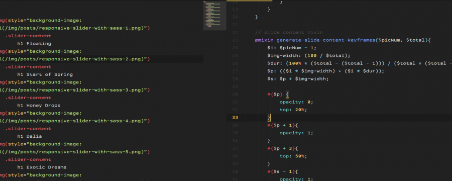
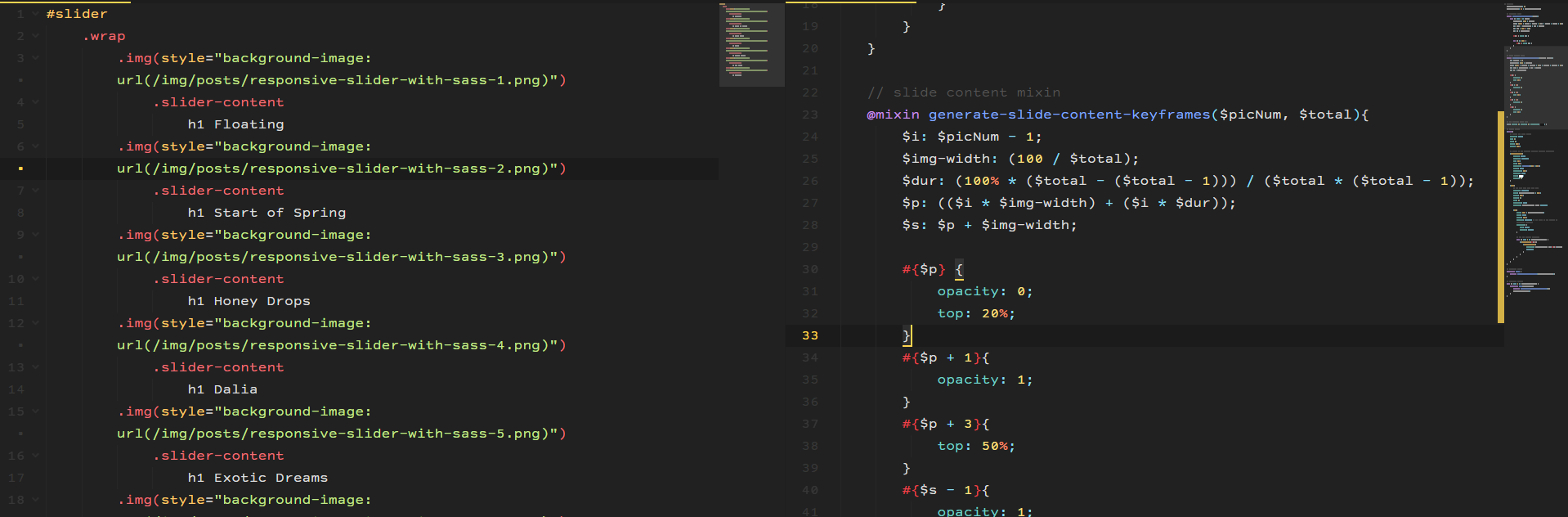
    #slider
        .wrap
            .img(style="background-image: url(/img/posts/responsive-slider-with-sass-1.png)")
                .slider-content
                    h1 Floating
            .img(style="background-image: url(/img/posts/responsive-slider-with-sass-2.png)")
                .slider-content
                    h1 Start of Spring
            .img(style="background-image: url(/img/posts/responsive-slider-with-sass-3.png)")
                .slider-content
                    h1 Honey Drops
            .img(style="background-image: url(/img/posts/responsive-slider-with-sass-4.png)")
                .slider-content
                    h1 Dalia
            .img(style="background-image: url(/img/posts/responsive-slider-with-sass-5.png)")
                .slider-content
                    h1 Exotic Dreams
            .img(style="background-image: url(/img/posts/responsive-slider-with-sass-6.png)")
                .slider-content
                    h1 Ice Queen
            .img(style="background-image: url(/img/posts/responsive-slider-with-sass-1.png)")
                .slider-content
                    h1 Floating
HTML:
    <div id="slider">
      <div class="wrap">
        <div style="background-image: url(/img/posts/responsive-slider-with-sass-1.png)" class="img">
          <div class="slider-content">
            <h1>Floating</h1>
          </div>
        </div>
        <div style="background-image: url(/img/posts/responsive-slider-with-sass-2.png)" class="img">
          <div class="slider-content">
            <h1>Start of Spring</h1>
          </div>
        </div>
        <div style="background-image: url(/img/posts/responsive-slider-with-sass-3.png)" class="img">
          <div class="slider-content">
            <h1>Honey Drops</h1>
          </div>
        </div>
        <div style="background-image: url(/img/posts/responsive-slider-with-sass-4.png)" class="img">
          <div class="slider-content">
            <h1>Dalia</h1>
          </div>
        </div>
        <div style="background-image: url(/img/posts/responsive-slider-with-sass-5.png)" class="img">
          <div class="slider-content">
            <h1>Exotic Dreams</h1>
          </div>
        </div>
        <div style="background-image: url(/img/posts/responsive-slider-with-sass-6.png)" class="img">
          <div class="slider-content">
            <h1>Ice Queen</h1>
          </div>
        </div>
        <div style="background-image: url(/img/posts/responsive-slider-with-sass-1.png)" class="img">
          <div class="slider-content">
            <h1>Floating</h1>
          </div>
        </div>
      </div>
    </div>
Textanimation
The way you animate does not matter too much. What concerns us is the way the slide animation and content animation interact with each other. There is no possibility with css to check if a slide is visible and then do something. This means, we do need another option to tell our content animation if it faces the viewer or is hidden somewhere.
The idea is that we need to consider the whole compositione. We have one slide animation. While one image is visible, we want our content to be animated, then it should do nothing, while the slide is hidden, and then restart. This means our content animation needs to be the same length as our slider animation. But the content animation is only happening within the percentage that the image is visible.
Okay, let’s check this out with for example the second image of my demo animation.
If we compile the mixin we wrote last time within my example we get the following CSS:
    @keyframes slidy {
        0% {
            left: 0%;
        }
        /* img 1 visible */
        14.2857142857% {
            left: 0%;
        }

        16.6666666667% {
            left: -100%;
        }
        /* img 2 visible */
        30.9523809524% {
            left: -100%;
        }

        33.3333333333% {
            left: -200%;
        }
        /* img 3 visible */
        47.619047619% {
            left: -200%;
        }

        50% {
            left: -300%;
        }
        /* img 4 visible */
        64.2857142857% {
            left: -300%;
        }

        66.6666666667% {
            left: -400%;
        }
        /* img 5 visible */
        80.9523809524% {
            left: -400%;
        }

        83.3333333333% {
            left: -500%;
        }
        /* img 6 visible */
        97.619047619% {
            left: -500%;
        }

        100% {
            left: -600%;
        }
    }
Okay, our second image is visible between 16% and 30% of our animation. This means our text animation for the second image needs to be within that percentage. This is different for image 3 or image x.
We realize: one animation is not enough, as it was with our slider animation. We need one animation for each of our contents. So each content needs its own keyframe declaration. Luckily we have the power of Sass having our back and for-loops are here to save the day.
So how do we need to write our mixin and how do we write the for loops? Do we need multiple loops? (yup, two to be exact)
No worries, there won’t be a ton of math like last time 😉
Okay, let’s have a look at last time’s mixin.
    @mixin generate-slide-keyframes($pics){
        @for $i from 0 to $pics{
            $img-width: (100 / $pics);
            $dur: (100% * ($pics - ($pics - 1))) / ($pics * ($pics - 1));
            $p: (($i * $img-width) + ($i * $dur));
            $l: ($i * 100% * -1);
            $s: $p + $img-width;

            #{$p} { left: $l; }

            @if $s <= 100% {
                #{$s} { left: $l; }
            }
        }
    }
We iterate from 0 to our amount of images and return each of the percentages. But since we only need specific percentages, we do not need a for loop. We want a specific percentage. This means, we need to hand our mixin the exact number that we want the percentage returned. The rest is pretty similar to what we had.
    @mixin generate-slide-content-keyframes($picNum, $total){
        $i: $picNum - 1;
        $img-width: (100 / $total);
        $dur: (100% * ($total - ($total - 1))) / ($total * ($total - 1));
        $p: (($i * $img-width) + ($i * $dur));
        $s: $p + $img-width;

        #{$p} {
            /* Bild erscheint */
        }
        #{$s} {
            /* Bild geht */
        }
    }
As you can see we definie $i and we remove 1 because the total images is not the real total, remember that we added the first image in the end again to ensure it animates smoothly?
Now we need to take care of the actual content animation. Mine is very simple. I just move the title down a little and fade it in. And in the end I fade it out.
So my resulting mixin looks like this:
    @mixin generate-slide-content-keyframes($picNum, $total){
        $i: $picNum - 1;
        $img-width: (100 / $total);
        $dur: (100% * ($total - ($total - 1))) / ($total * ($total - 1));
        $p: (($i * $img-width) + ($i * $dur));
        $s: $p + $img-width;

        #{$p} {
            opacity: 0;
            top: 20%;
        }
        #{$p + 1}{
            opacity: 1;
        }
        #{$p + 3}{
            top: 50%;
        }
        #{$s - 1}{
            opacity: 1;
        }
        #{$s} {
            opacity: 0;
            top: 50%;
        }
    }
How to add the for loops? We put one around the keyframe declaration and one around the css where we call the animation.
Here the isolated version of the specific code within the whole Sass.
    #slider{
        .wrap{
            .img{
                @for $i from 1 to $amount-slider-imgs {
                    &:nth-of-type(#{$i}){
                        .slider-content{
                            animation: $animation-time img-#{$i}-content infinite;
                        }
                    }
                }
            }
        }
    }

    @for $i from 1 to $amount-slider-imgs {
        @keyframes img-#{$i}-content{
            @include generate-slide-content-keyframes($i, $amount-slider-imgs);
        }
    }
And that’s how you add a text animation. Obviously we need some more styles. My complete Sass for this demo looks like this:
    // Settings
    $amount-slider-imgs: 7;
    $animation-time: 6s * $amount-slider-imgs;

    // keyframes mixin
    @mixin generate-slide-keyframes($pics){
        @for $i from 0 to $pics{
            $img-width: (100 / $pics);
            $dur: (100% * ($pics - ($pics - 1))) / ($pics * ($pics - 1));
            $p: (($i * $img-width) + ($i * $dur));
            $l: ($i * 100% * -1);
            $s: $p + $img-width;

            #{$p} { left: $l; }

            @if $s <= 100% {
                #{$s} { left: $l; }
            }
        }
    }

    // slide content mixin
    @mixin generate-slide-content-keyframes($picNum, $total){
        $i: $picNum - 1;
        $img-width: (100 / $total);
        $dur: (100% * ($total - ($total - 1))) / ($total * ($total - 1));
        $p: (($i * $img-width) + ($i * $dur));
        $s: $p + $img-width;

        #{$p} {
            opacity: 0;
            top: 20%;
        }
        #{$p + 1}{
            opacity: 1;
        }
        #{$p + 3}{
            top: 50%;
        }
        #{$s - 1}{
            opacity: 1;
        }
        #{$s} {
            opacity: 0;
            top: 50%;
        }
    }

    // the smallest reset ever
    body{ margin: 0; padding: 0; background: black; }

    // Slider styles
    #slider{
        // covers the whole screen
        position: fixed;
        top: 0;
        left: 0;
        width: 100%;
        height: 100%;

        // styles of the content, centered absolute positoning
        .slider-content{
            display: block;
            position: absolute;
            top: 50%;
            left: 50%;
            transform: translate(-50%, -50%);
            height: auto;
            max-height: 100%;
            overflow: auto;
            color: white;
            opacity: 0;
        }

        .wrap{
            // you know that from last time
            position: relative;
            width: $amount-slider-imgs * 100%;
            height: 100%;
            margin: 0;
            left: 0;
            text-align: left;
            animation: $animation-time slidy infinite;

            .img{
                width: 100% / $amount-slider-imgs;
                float: left;
                height: 100%;
                position: relative; // add this, so the content is positioned correctly
                background: {
                    size: cover;
                    position: center;
                }

                // for the content animation
                @for $i from 1 to $amount-slider-imgs {
                    &:nth-of-type(#{$i}){
                        .slider-content{
                            animation: $animation-time img-#{$i}-content infinite;
                        }
                    }
                }
            }
        }
    }

    // keyframes slider
    @keyframes slidy {
        @include generate-slide-keyframes($amount-slider-imgs);
    }

    // keyframes content
    @for $i from 1 to $amount-slider-imgs {
        @keyframes img-#{$i}-content{
            @include generate-slide-content-keyframes($i, $amount-slider-imgs);
        }
    }
And that’s all.