I was looking for a simple responsive image Slider featuring as little markup as possible. It should not be fancy or packed with features, just plain old scrolling through some images. While searching CodePen for inspiration I acutally ran over this pen which was doing exactly what I wanted. Also with CSS only. But when I was trying to write keyframes for another amount of images I though that it would get way overboard if I needed to recalculate the numbers whenever I wanted to change the image count. So I took over the CSS into my Sass workspace and wrote a mixin for the keyframes. This is what I want to go over today. You can check out the demo here if you want to have it full screen.
Markup
In my exmaple I’m using a slider with a fixed aspect ratio (3:2), so I needed a container for the padding hack1. Apart from that we need a wrapper which we’ll give an overflow: hidden and in there we’ll create an image strip, where the images will be put next to each other and we’ll scroll through that. To ensure the animation is smooth, we’ll actually add the first image at the beginning and end of the strip. I added the pictures as background images of divs, because I find it easier to work with. Especially if one image has a bit of a different format.
Markup in jade:
    .size-control
        #slider
            .wrap
                .img(style="background-image: url(1.png)")
                .img(style="background-image: url(2.png)")
                .img(style="background-image: url(3.png)")
                .img(style="background-image: url(4.png)")
                .img(style="background-image: url(5.png)")
                .img(style="background-image: url(6.png)")
                .img(style="background-image: url(1.png)")
and generated HTML
    <div class="size-control">
        <div id="slider">
            <div class="wrap">
                <div style="background-image: url(1.png)" class="img"></div>
                <div style="background-image: url(2.png)" class="img"></div>
                <div style="background-image: url(3.png)" class="img"></div>
                <div style="background-image: url(4.png)" class="img"></div>
                <div style="background-image: url(5.png)" class="img"></div>
                <div style="background-image: url(6.png)" class="img"></div>
                <div style="background-image: url(1.png)" class="img"></div>
            </div>
        </div>
    </div>
Styling
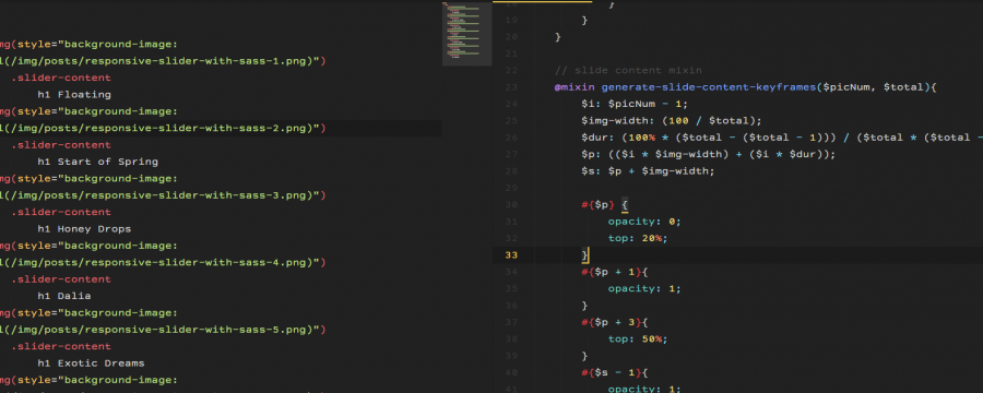
For the styling we’ll definitely need the image count. I am using 6 different ones, but because the first one is added twice, the total comes up to 7. Also I want each of my images to have a total view time of 6s. So for the animation lenght we’ll just \( imgCount \cdot imgViewTime \) to get the total animation timeframe. So I created two Sass variables for that:
    $amount-slider-imgs: 7;
    $animation-time: 6s * $amount-slider-imgs;
The rest of the Sass should be pretty self-explanatory. Apart from the keyframes the slider is super easy to write:
    // paddinghack mixin
    @mixin paddinghack($cw, $rw, $rh, $c:null){
        position: relative;
        width: $cw;
        height: 0;
        padding: (($rh / $rw) * $cw) 0 0 0;

        @if $c != null{
            #{$c} {
                position: absolute;
                top: 0;
                left: 0;
                right: 0;
                bottom: 0;
                width: 100%;
                height: 100%;
            }
        }
    }

    // centering on body
    .size-control{
        @include paddinghack(60%, 1500, 1000, "#slider");
        position: absolute;
        top: 50%;
        left: 50%;
        transform: translate(-50%, -50%);
    }

    // slider style
    #slider{
        overflow: hidden;
        box-sizing: border-box;

        .wrap{
            position: relative;
            width: $amount-slider-imgs * 100%; // calculates imagestrip width
            height: 100%;
            margin: 0;
            left: 0;
            text-align: left;
            font-size: 0;
            animation: $animation-time slidy infinite;

            .img{
                width: 100% / $amount-slider-imgs;
                float: left;
                height: 100%;
                background: {
                    size: cover;
                    position: center;
                }
            }
        }
    }
Keyframe Mixin
As soon as that’s done we are in the keyframe generation stage. Writing these was acutally not as simple as I had originally thought. I’ll just turn this into a mixin, so I can use it across multiple pages, but if you only want to use it once, feel free to use all of this code just within your keyframe declaration.
Goals
This is what we are looking for in a formula-kinda-you-know-what-I-mean fashion. We’ll be looking for the \( x \) most of the time. This is basically a representative of our slide view time in a percentage.
    $pics-count: $n;
    $img-width: 100% / $n;
    $w: $img-width;

    @keyframes slider-goal {
        (0 * $w) + (0 * x) { left: 0 * 100% * -1; }
        (1 * $w) + (0 * x) { left: 0 * 100% * -1; }

        (1 * $w) + (1 * x) { left: 1 * 100% * -1; }
        (2 * $w) + (1 * x) { left: 1 * 100% * -1; }

        (2 * $w) + (2 * x) { left: 2 * 100% * -1; }
        (3 * $w) + (2 * x) { left: 2 * 100% * -1; }

        ...

        (($n - 1) * $w) + (($n - 1) * x) { left: ($n - 1) * 100% * -1; }
    }
As you can see we’ll need to generate a keyframe pair for each image. This means that we’ll have to use a for-loop for sure, because most of the values depend on an index ($i). The repetition of the same left value stands for the time that the image is in view. \( x \) will then represent the 6s view time that we defined before, but we’ll neet to translate that into a keyframe percentage. If we didn’t need that last keyframe this would be much easier, but the last frame ensures, that our animation runs smoothly in an infinite loop. But since the last image only needs the sliding in part of the animation and not the sliding out, we only need the first part of the pair. Also the last percentage of the keyframe needs to be 100%. That will be helpful with finding \( x \), because we can create an equation from that and that makes finding unknown variables quite easy to find.
Math
First of all we need to know what values we need for our mixin. Because we only have the image count, that’s basically everything we can our mixin dependant on. So we need to try and represent each of the components with this variable.
Let’s start our declaration
    // keyframes mixin
    @mixin generate-slide-keyframes($pics){
        // mixin content
    }
We also know that the index is important, so let’s start the for loop.
    @for $i from 0 to $pics {
        // content
    }
Now for the numbers we do know. We can calculate the image width pretty fast. (\( iw \) = $img-width | \( \sum pics \) = $pics)
\( iw = \frac{100\%}{\sum pics} \)For the left value calculation is easy too
the keyframe percentages are alos easy. I call them $p (percentage) and $s (step) but use whatever you want. $dur is still our unknown (\( x \)).
Of course we can shorten that by replacing certain elements with predefined variables, if we pay attention to order. Also the keyframe pair is easy to put together.
    $img-width: (100 / $pics);
    $dur: x;
    $p: (($i * $img-width) + ($i * $dur));
    $l: ($i * 100% * -1);
    $s: $p + $img-width;

    #{$p} { left: $l; }
    #{$s} { left: $l; }
Now for the omnious \( x \). To get the solution, we’ll need to solve our equation.
if you go back to the goal section, you can see that we found out the following:
\( iw(\sum pics – 1) + x(\sum pics – 1) = 100\% \)We can solve that for \( x \) (to make the equation a little faster to understnad I just replaced $pics and ($pics - 1) with shorter variables.
key: steps to come to the next equation
(1): on left side add \( z \) to fraction
(2): on left side \( zx \to \frac{zx}{1} \xrightarrow{\cdot y} \frac{y(zx)}{1y} \) and combine into one fraction
(3): on left factorize \( z \)
(4): on both sides \( \cdot y \)
(5): on left side get rid of brackets
(6): on both sides \( -100z \)
(7): on both sides \( \mathbin{/} yz \)
What we have to take into account is that we do not need the $s keyframe, because $p will be 100%. So to get rid of the second part for the last image, we just put it into an @if that will not add the frame, if the percentage is above 100%.
And then the mixin is done:
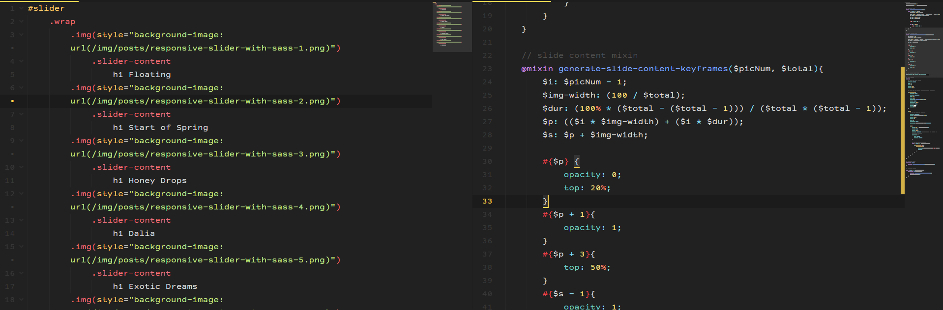
    @mixin generate-slide-keyframes($pics){
        @for $i from 0 to $pics{
            $img-width: (100 / $pics);
            $dur: (100% * ($pics - ($pics - 1))) / ($pics * ($pics - 1));
            $p: (($i * $img-width) + ($i * $dur));
            $l: ($i * 100% * -1);
            $s: $p + $img-width;

            #{$p} { left: $l; }

            @if $s <= 100% {
                #{$s} { left: $l; }
            }
        }
    }
To end our stylesheet, just add the following:
    @keyframes slidy {
        @include generate-slide-keyframes($amount-slider-imgs);
    }
And if you want to check out the code for the demo.