This is a very quick overview on how to use my Grid brushes
This is a very quick overview on how to use my Grid brushes
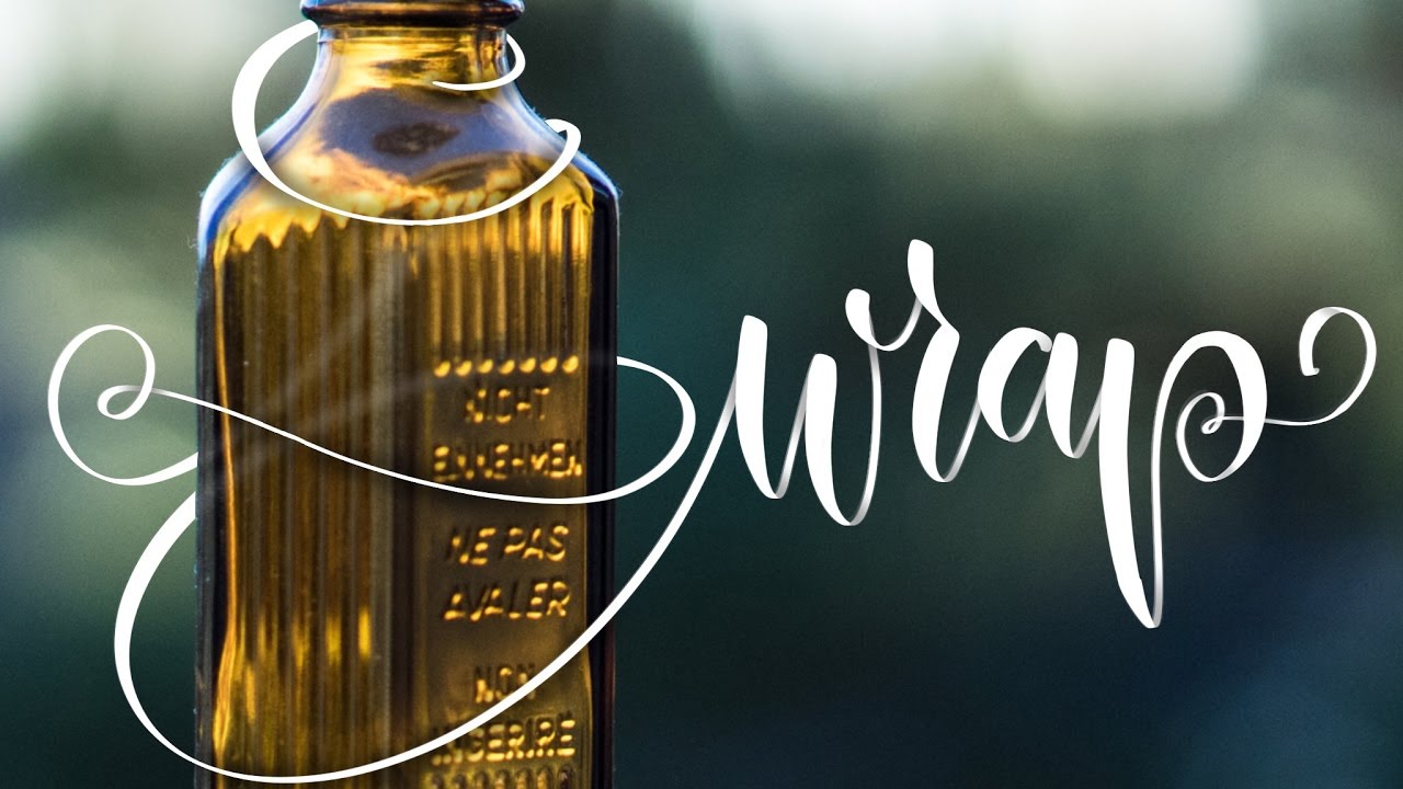
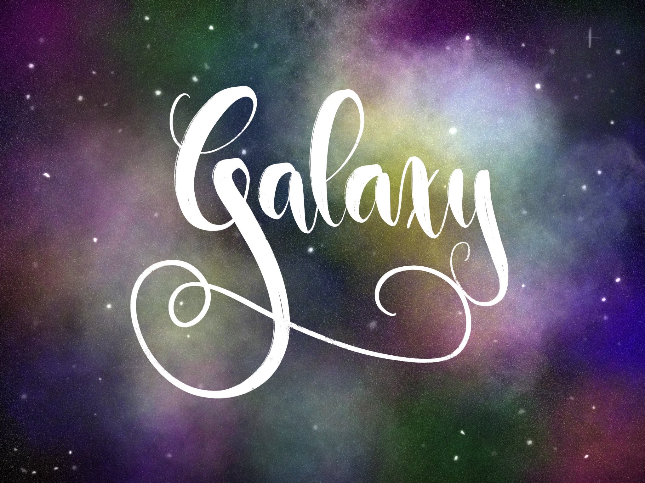
A quick Tutorial on wrapping text around image elements.
I’m doing this in Procreate App on an iPad Pro (9.7 inch) but the same concept applies to any app that comes with layer support and a brush tool
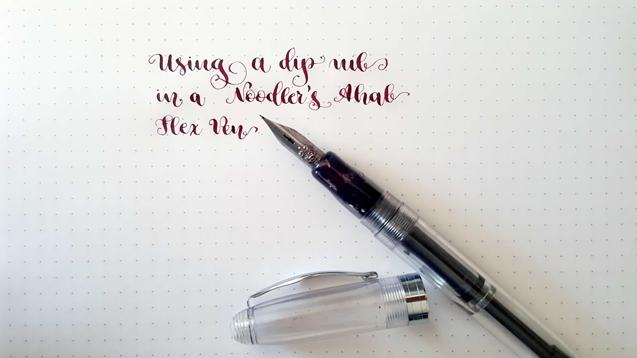
PLEASE READ ON FOR TIPS AND ANSWERS (nibs and Ink and Paper)
** NIB OPTIONS **
The Nib I am using is E.W. Leo Rose Nib. Supposedly most G-Nibs and Rose Nibs do work. I have tried John Mitchell’s Rose, Zebra G, Nikko G and Tachikawa G in my Ahab and even though I could fit all of them on there, most of the other nibs left quite a big gap between feed and nib which resulted in lots of railroading. You could fix that if you heat set the feed. Since the feed is made of ebonite it gets pliable when heated and so you should be able to fix any gaps. The E.W. Leo nib did not require heat setting, which is why I would recommend it, if you can find one. I got mine at a flea market, so I don’t really have any source I could recommend.
** INK **
This only works with a very wet flowing ink. I have tried it with Pelikan 4001 ink and have not gotten the pen to write, even if it had just been writing perfectly with Apache Sunset. Noodler’s Ink works great for that, but this will require you to use good bleed-proof paper.
** PAPER **
Since Noodler’s Ink had a tendency to bleed sometimes, and wet flowing inks in General have this tendency you should use high quality paper. If you get premium laserjet printer paper, Clairfontaine or Rhodia you should definitely be on the safe side.
I’m sorry for the blurriness you get from time to time, I hope this will help you out.
Okay, this is my first voice-over let me know if you find it helpful or if you prefer me adding music and some annotations when necessary.

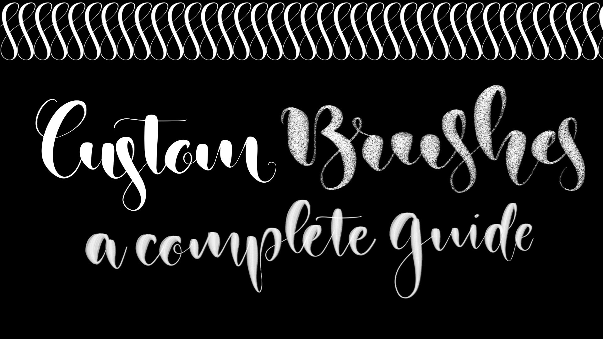
The pressure curve in procreate seems to be kind of a mystery for a lot of people. As soon as it goes into curve some have problems because it looks quite abstract. But if you get the curve right, you can improove your results greatly, without having to master any additional skill.
I think the pressure curve is one of the most significant settings in iPad lettering, since differences of thick and thin are what brush lettering is all about.
In this short guide I’d like to take you along with my personal little search for my optimal pressure curve. I hope my tips can help you find yours too. Continue reading “The perfect pressure curve for your iPad Lettering”