The pressure curve in procreate seems to be kind of a mystery for a lot of people. As soon as it goes into curve some have problems because it looks quite abstract. But if you get the curve right, you can improove your results greatly, without having to master any additional skill.
I think the pressure curve is one of the most significant settings in iPad lettering, since differences of thick and thin are what brush lettering is all about.
In this short guide I’d like to take you along with my personal little search for my optimal pressure curve. I hope my tips can help you find yours too.
The great thing about working digitally is the possibility to personalize. The curve is great if you are looking for the optimal visual result of your lettering.
How the curve works
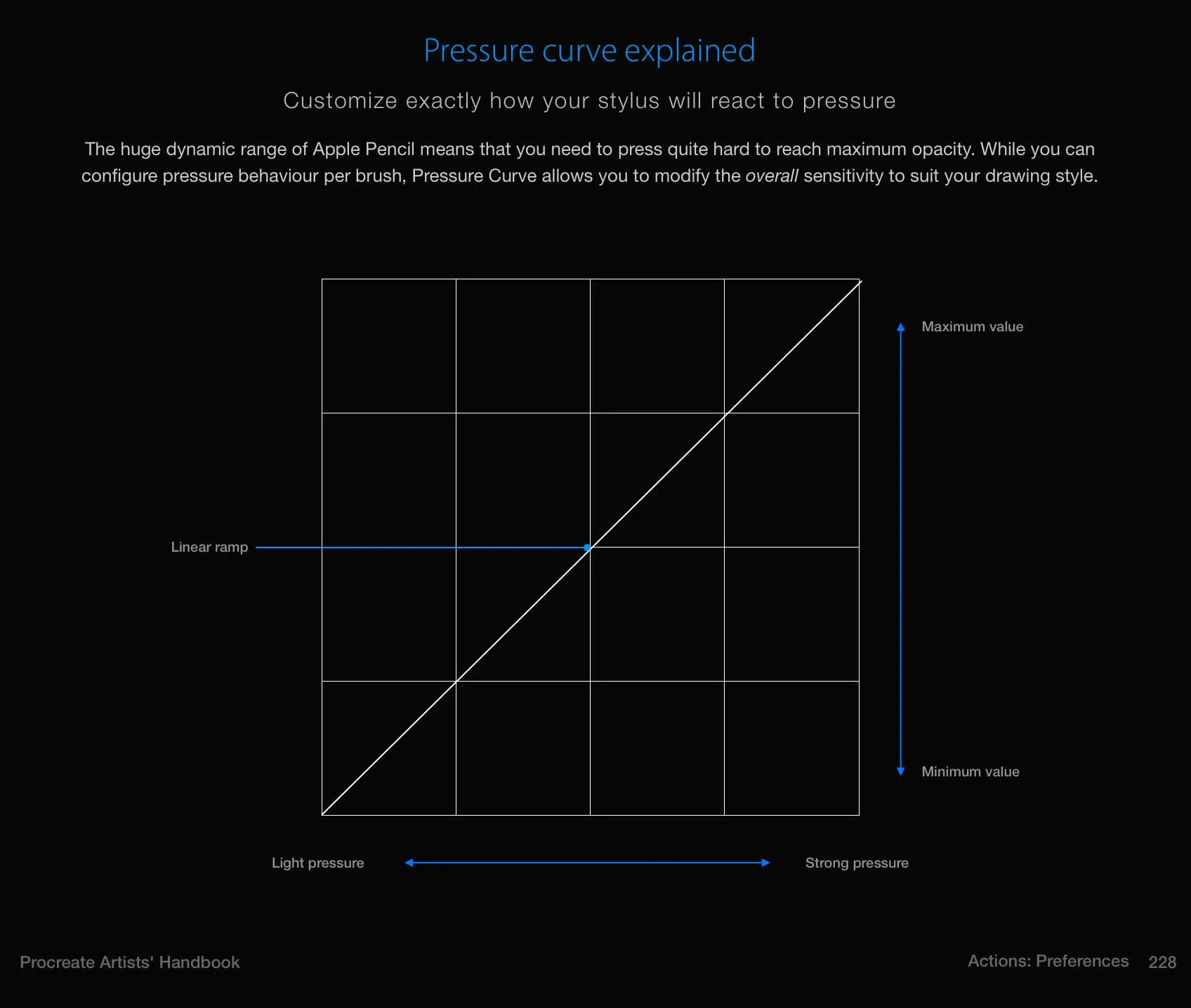
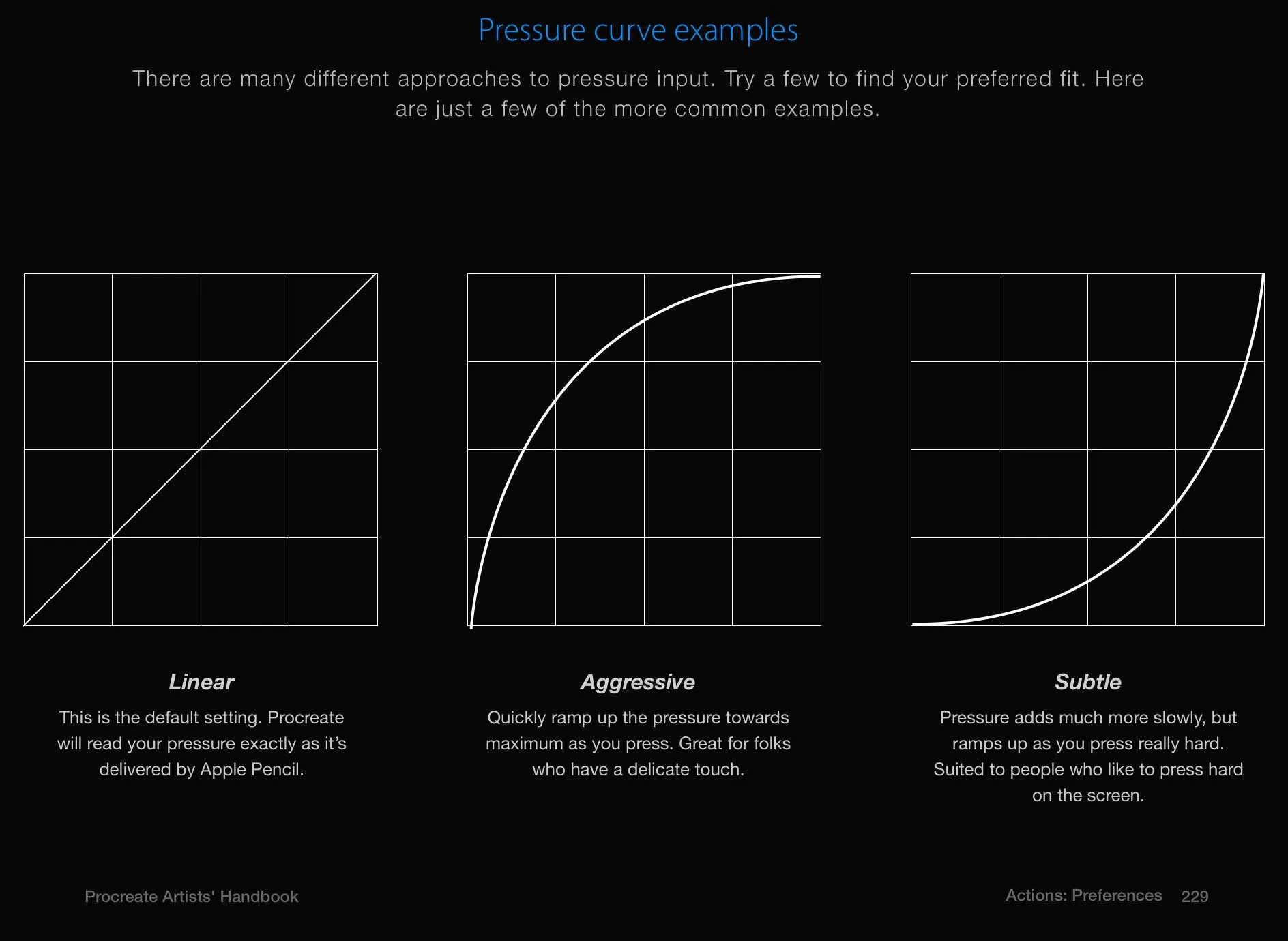
How the curve worksI do realize quite often that a lot of people haven’t read the procreate handbook. The App has soooo many features and the guys from Savage did a fantastic job at explaining it. It’s all illustrated and written in a very minimal but highly informative style. You most definitely should give it a read.
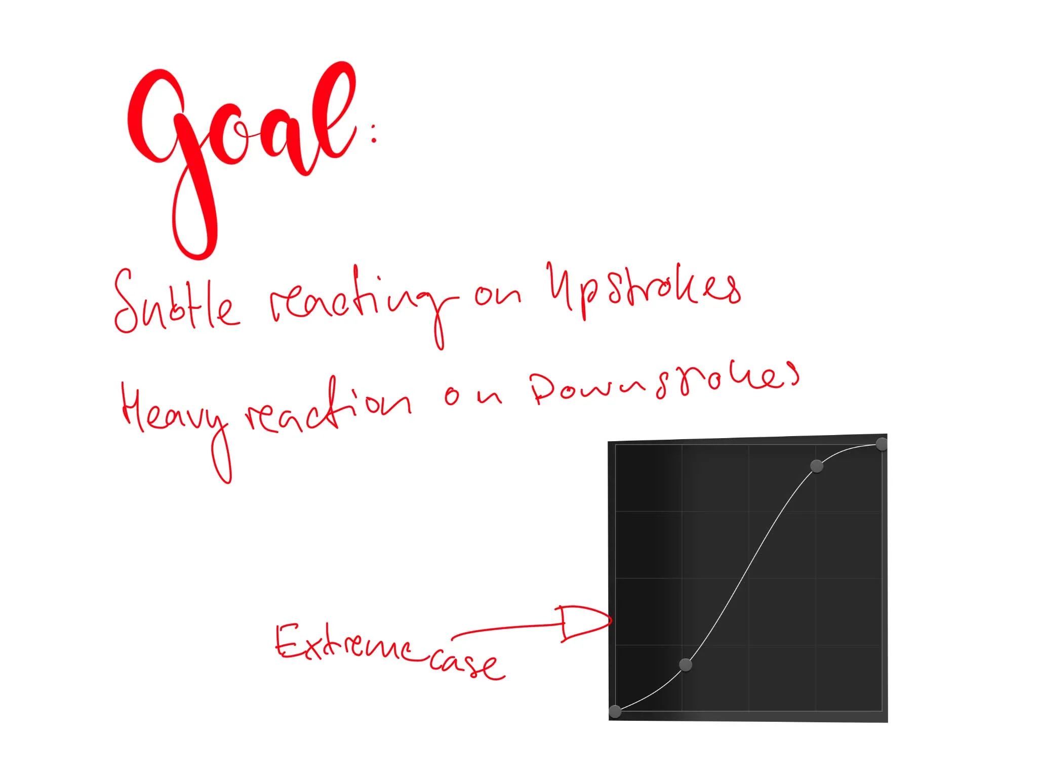
So because it is explained perfectly in the handbook, I am just gonna share two screenshots here and let you (re)read it, what the pressure curve is and how two extreme examples would look.
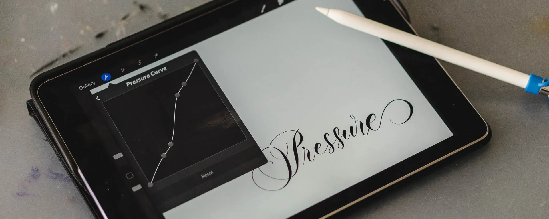
What kind of brush you should use to test
What kind of brush you should use to testBefore tweaking your curve you should have the right brush. The brush you want to use for this testing is one without restrictions pressure wise. I am going to give you a more in-depth explanation what that means in my upcoming custom brush guide, but for now I am gonna tell you that the brush I used is my free brush “Max V” You can grab it on my Procreate Brush Page.
Okay, you’ve got the brush, you’ve got an idea how the curve works, so let’s find the perfect one for you.
The Search
The SearchYour first step should be a comparison.
In this test you should practice an up and a downstroke, always using the same amount of pressure but using different curves. you want to test it with the default and then create curves that look like the two examples. You might also want to take a screenshot with each, so you don’t forget.
Then practice your lines. YOu want to put them all next to each other, and then evaluate. Look at the lines and determine what you like and what you don’t like.
I literally scribble on there because I always write stuff down.
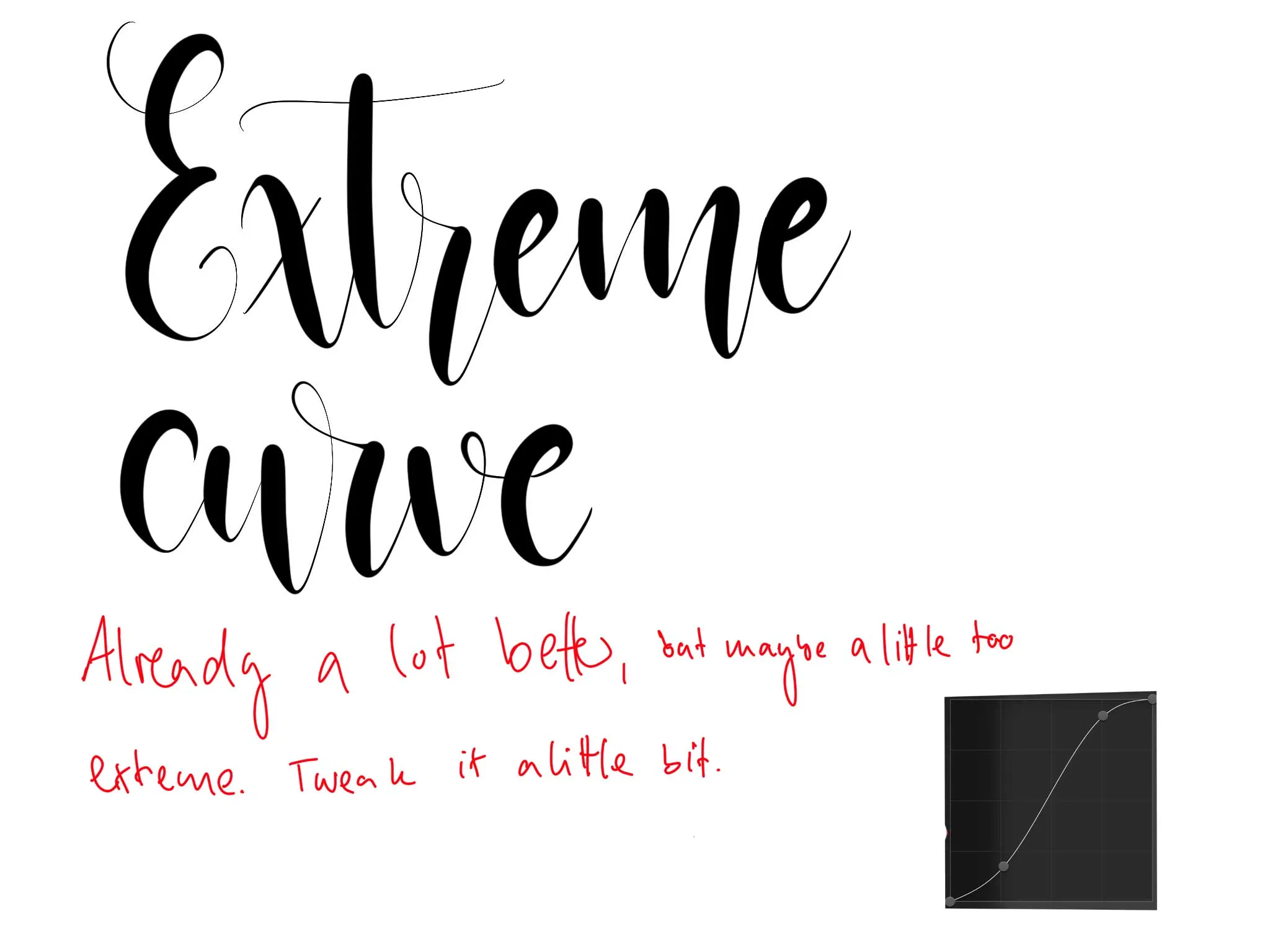
As you can see my first result was that I liked one part of each curve. So I conculded another extreme case curve, which I then tested.
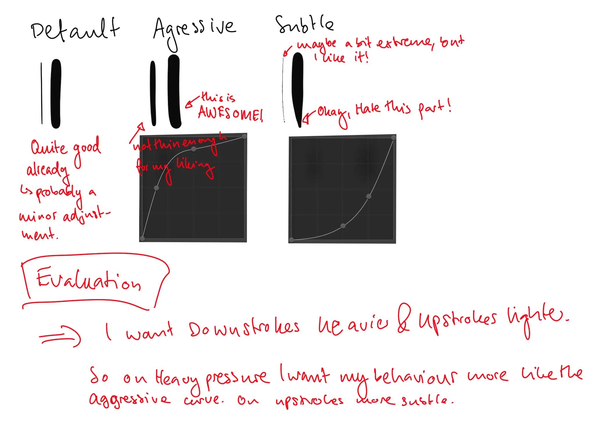
Once I got this new curve I knew that that would be my basic shape, but I had to soften it a little bit.
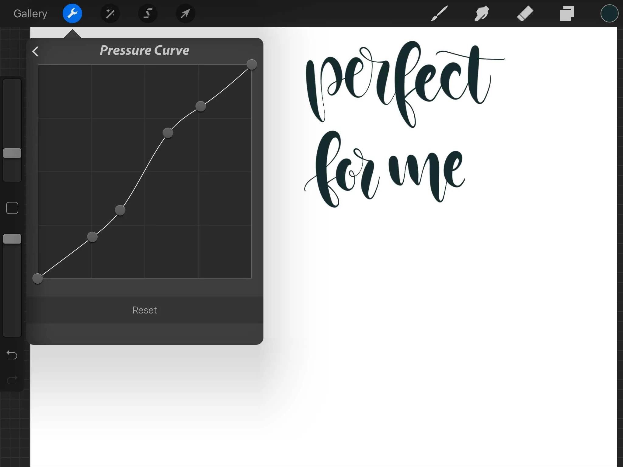
I kept the curve and practiced writing, always adjusting slightly until I came up with my perfect curve.
The process of finding the curve might take a while. This test will help you find the basic shape. After that take a few days and test your curve. tweak it as you go and at some point you’ll just have it.
My pressure curve helps me make my hairlines thinner and my shades thicker, which is exactly what I want. A super high contrast between thick and thin.
I hope those tips help you find your personal curve. If you do find it (or already have) let me know what it looks like, I find it really interesting!