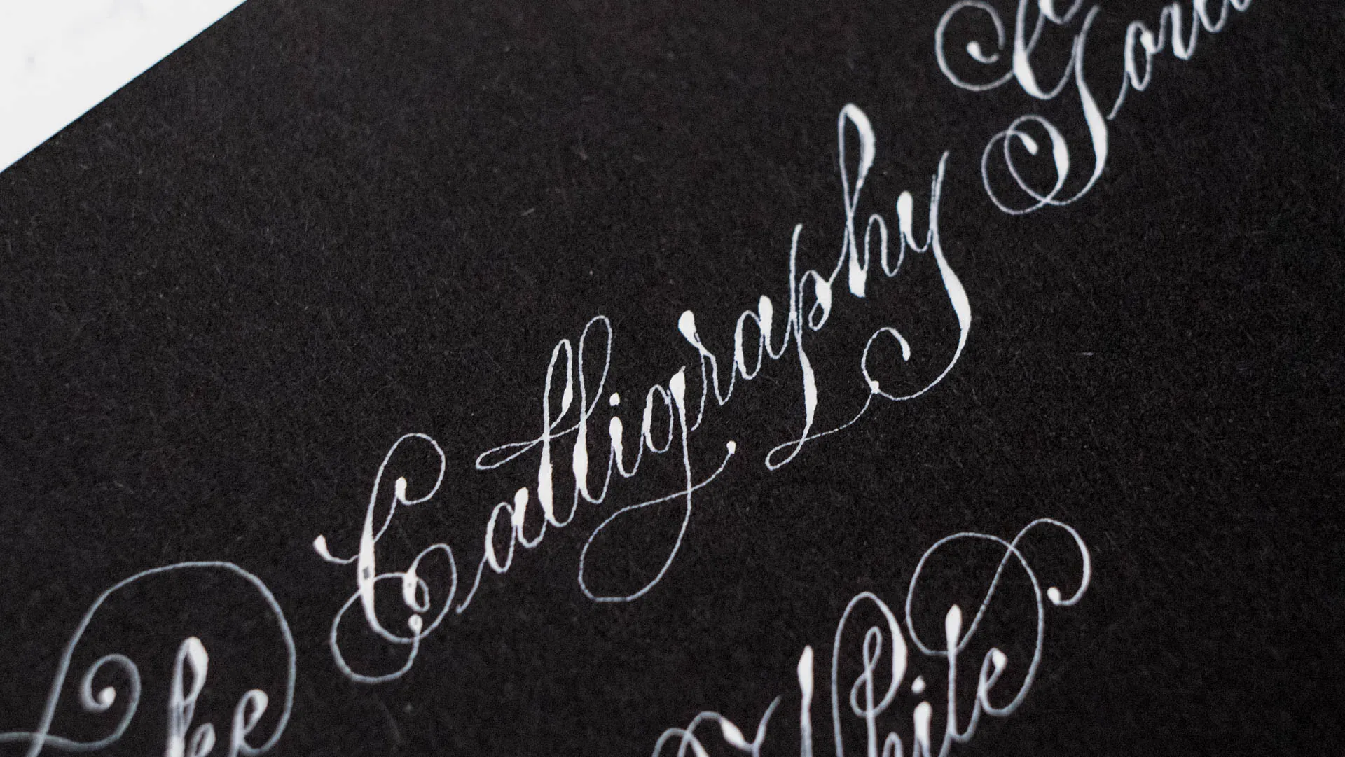
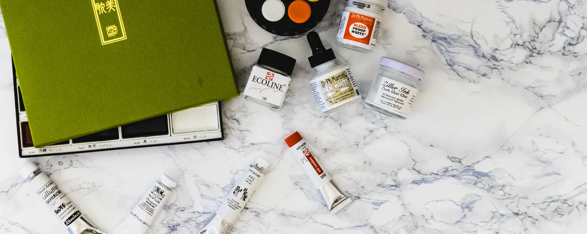
White Inks are a whole subject of their own. A while ago I wrote about black inks and the different types of inks available, so I’ll just reference you to that for this kind of information. This time round, I dug out all of the white inks I had available (and bought some new ones) to give you an ultimate white ink showdown.
Inks You Won’t Find in this list
Inks You Won’t Find in this listSo there are two rather popular white Inks not in this list, which is the Moonpalace White Sumi ink and the Speedball white ink. Speedball is a shellac ink which is just generally what I stay away from. And Moonpalace was not available when I got all of the other whites that I didn’t have already, and I coulnd’t justify paying $22 shipping on an ink who’s reviews didn’t look as promising as the others I ordered. I will probably give it a try in the future, if I do I’m making sure to update this post.
Inks in this List
Inks in this ListI have 5 watercolors (one of them Gansai, what the difference is can be read in my black ink post) 4 Gouaches and 1 acrylic ink (I also attempted to use actual acrylic paint, but it was so bad, I’m not even going to include it here. So let’s find the Top 3 shall we?
Consistency
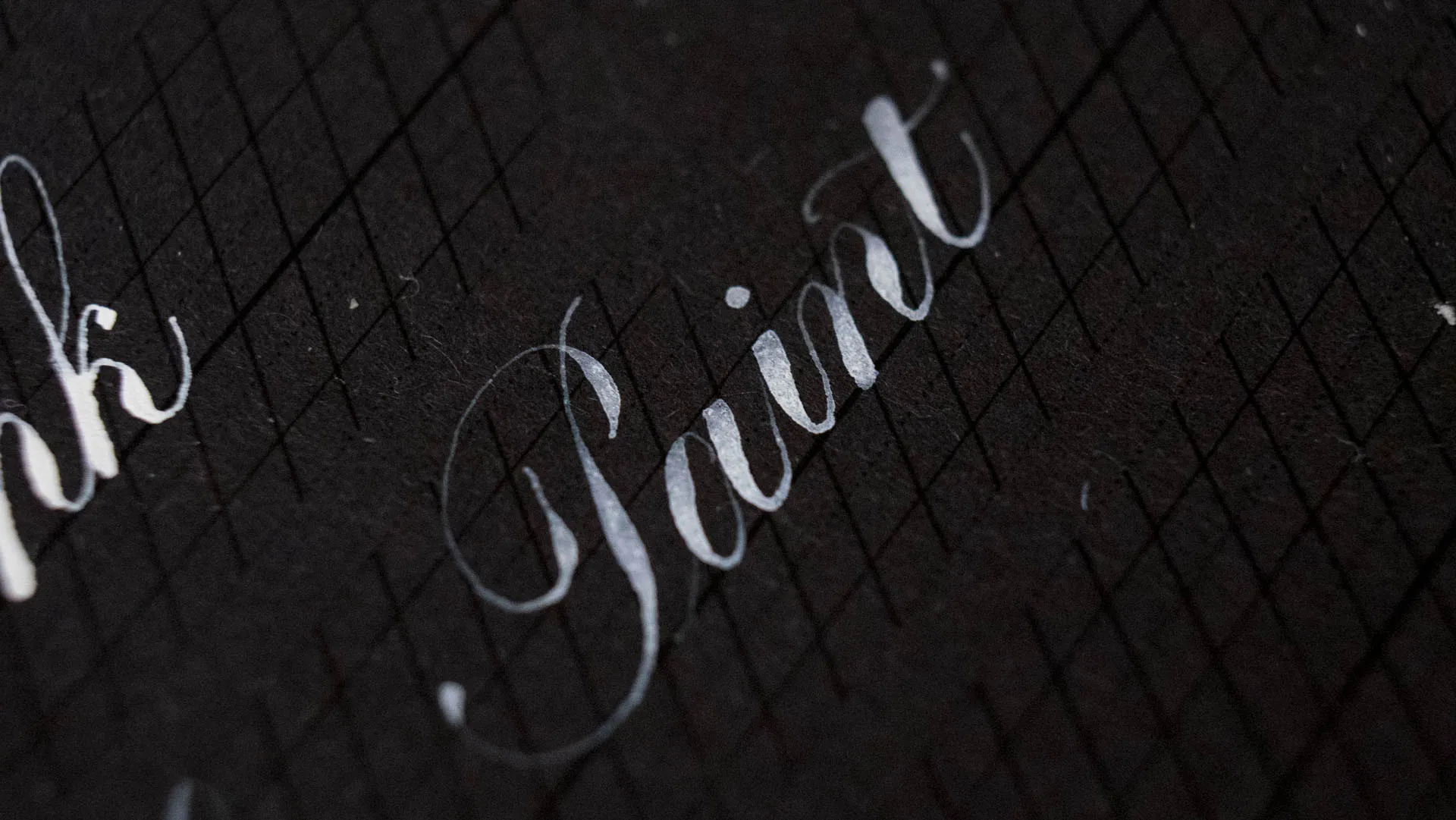
ConsistencyBecause it always comes up, when I post about inks I brush on my nib on Instagram. Almost all of these Inks where diluted (all except the Ziller, actually) the Gouache and watercolor need diluting because they won’t flow at all otherwise. I mix up my ink to the consistency of milk, I do like it thin because it helps me create very thin hairlines, however it results in less pigmentation. I wanted to know how these would perform at my favorite consistency. Some of these can be built up and look better used a bit thicker, which will be mentioned. In terms of applying these inks, you want to mix them up with a cheap brush (never doom a good brush to nib painting duty!) and paint it on the backside of the nib (front is not necessary). Shake the nib once to get rid of excess and write. Make sure to wash the nib every once in a while, lots of these gunk up your nibs with time.
The Showdown
The ShowdownAll of these samples were written with a Perry 28 vintage nib, not new, but still fairly good. The 3 final ones were written with a Hunt 101 nib.
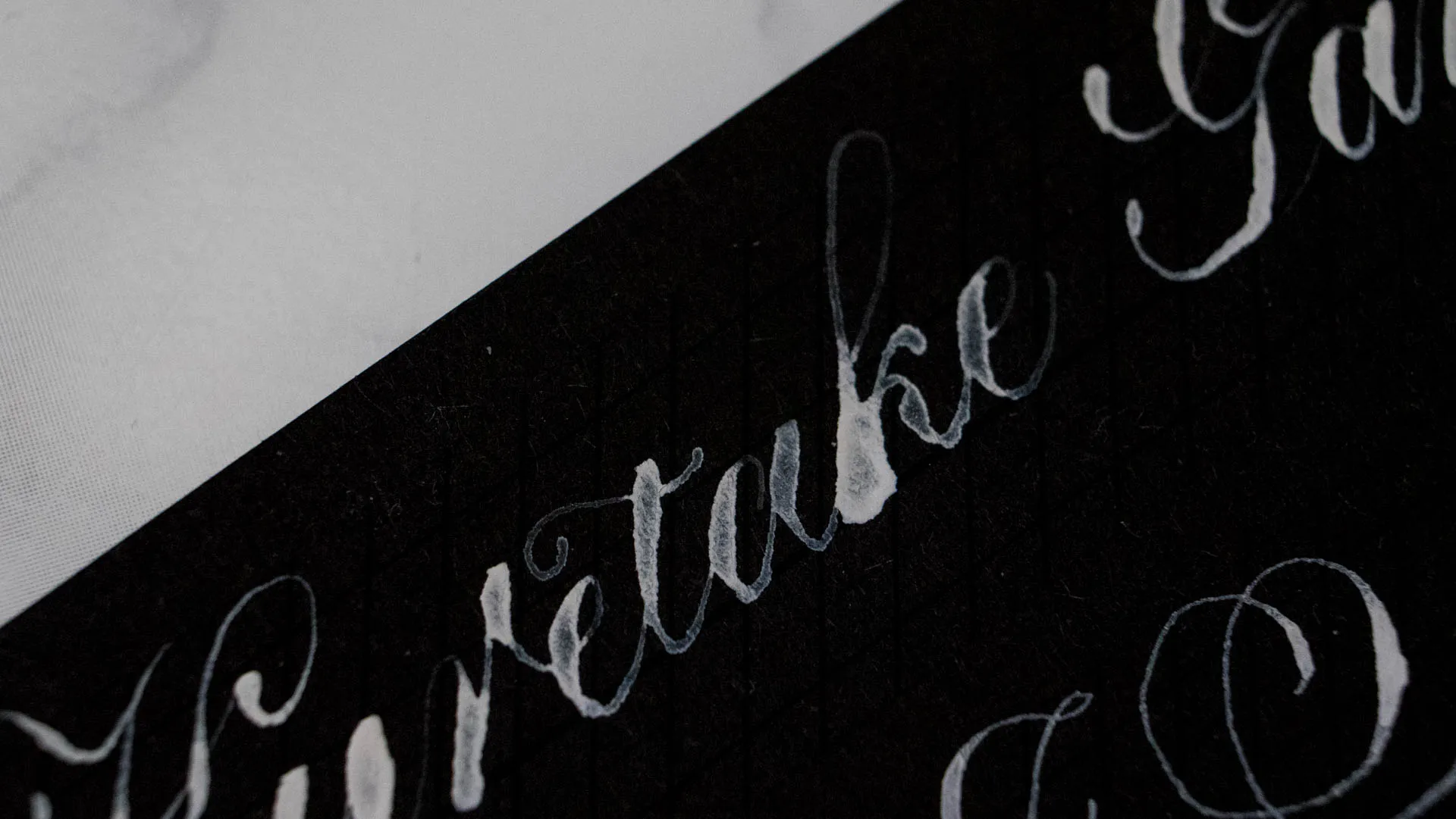
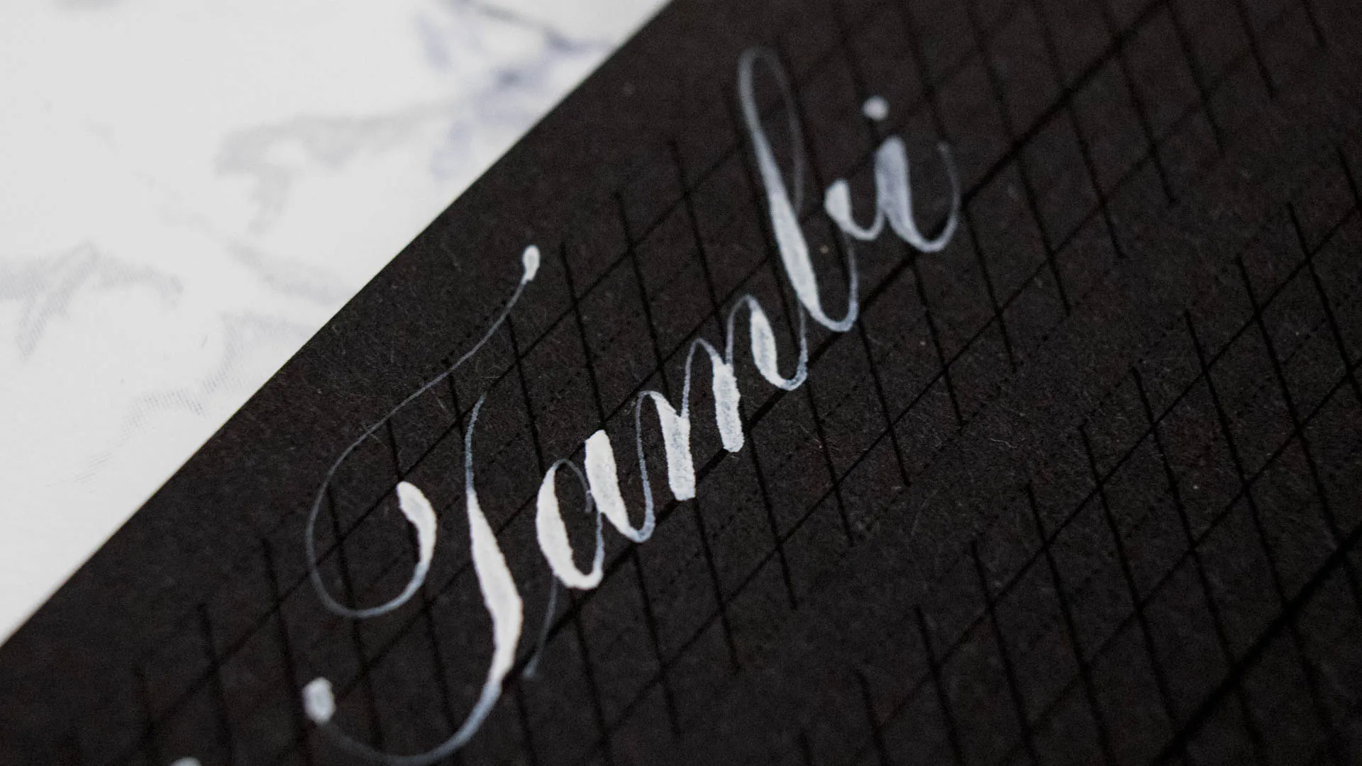
Kuretake Gansai Tambi White
Kuretake Gansai Tambi White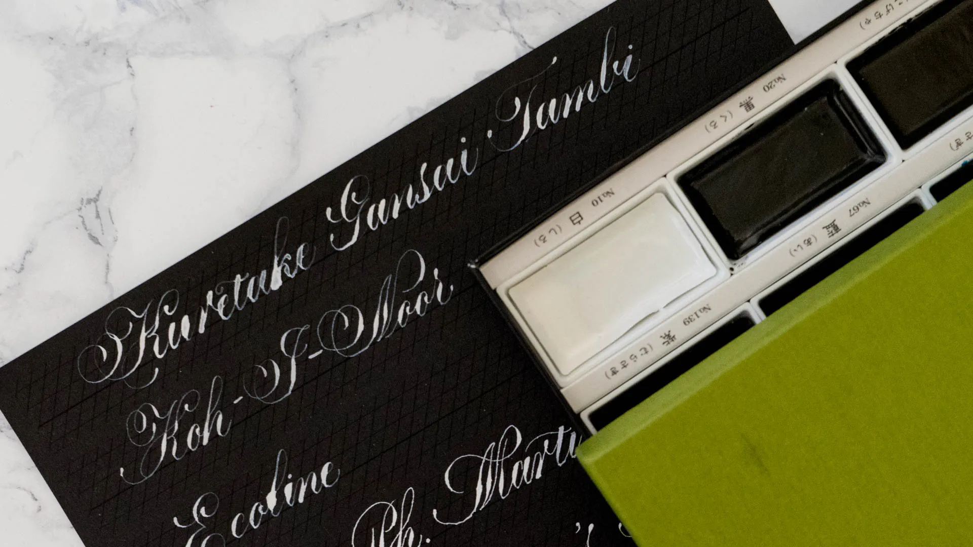
I adore the Gansai Paints for Calligraphy, they have a bit more of a shiny finish and flow amazingly well off the pen. However, this white is just not opaque and wouldn’t mix up to a consistency that flows as well as the others. It was too thick and in the next second too thin and made a huge mess. Surprisingly the opacity was a lot worse than I expected, because those colors show up incredibly vibrant on white paper. So I was surprised and a little bit disappointed in this paint.
Koh-I-Noor Student-Grade Watercolor White
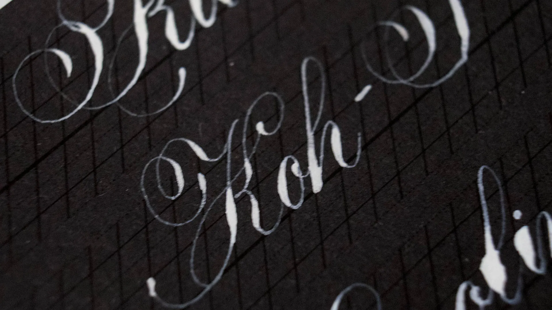
Koh-I-Noor Student-Grade Watercolor White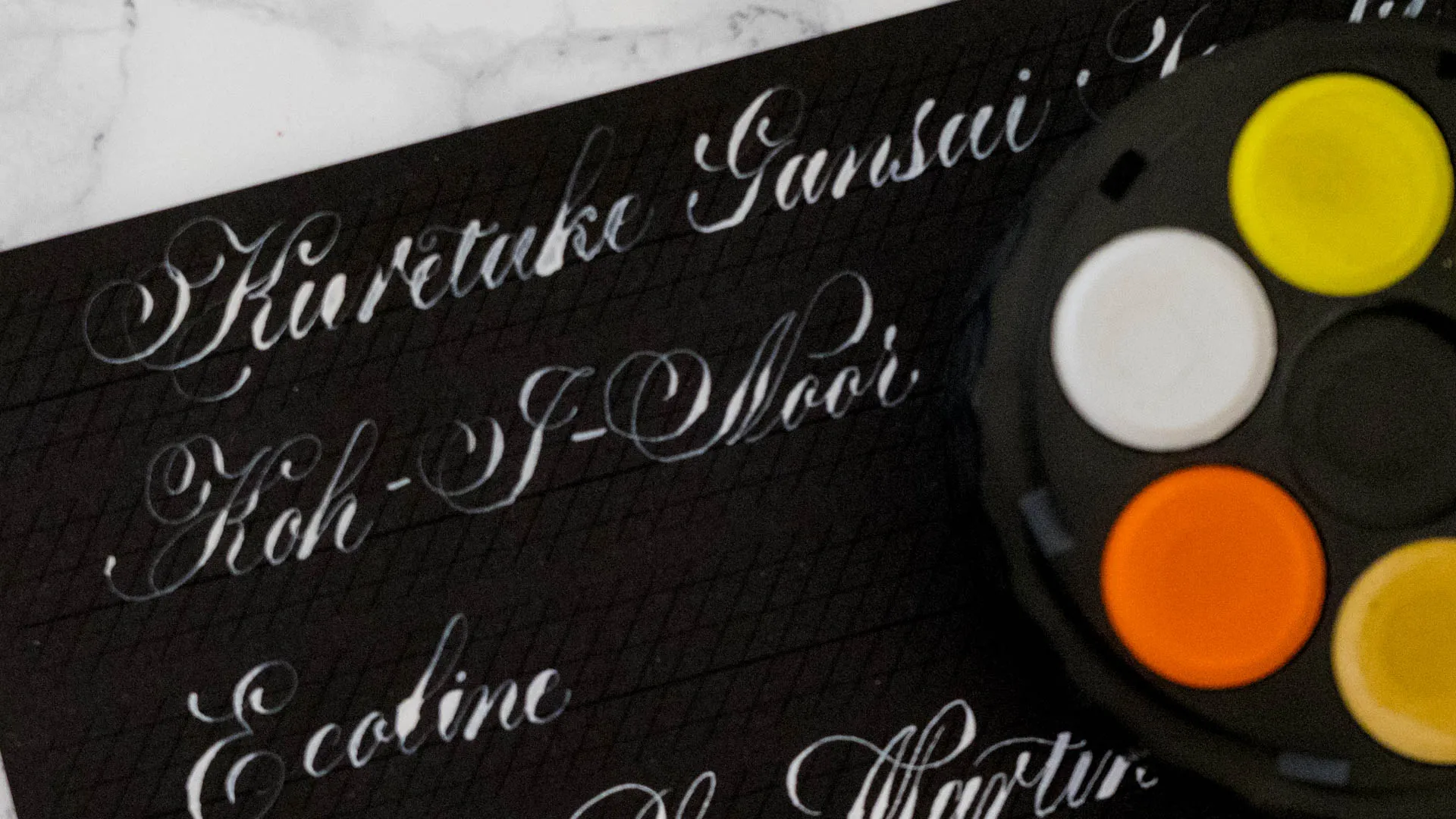
This was a fun little experiment. I had gotten this stacked tower of very cheap paints during a trip to Berlin and was extremely surprised by the quality of the black in there and how pigmented it was. Those colors are extremely smooth used with a nib, but they end up very chalky. The white was no different here and fit with the general rest of the palette. As you can see, the hairlines turned out very nice but there is basically no opacity at all.
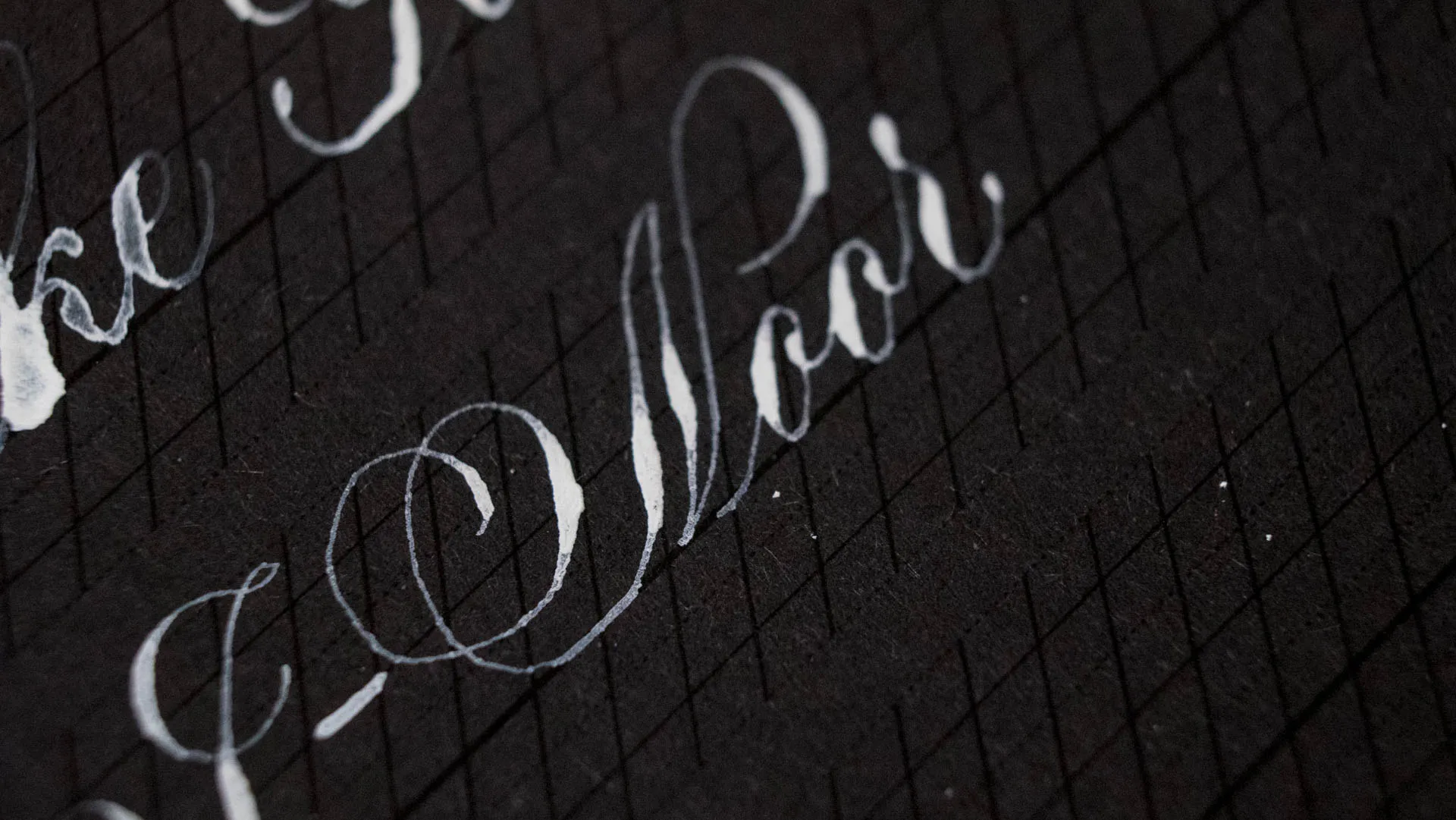
Ecoline White
Ecoline White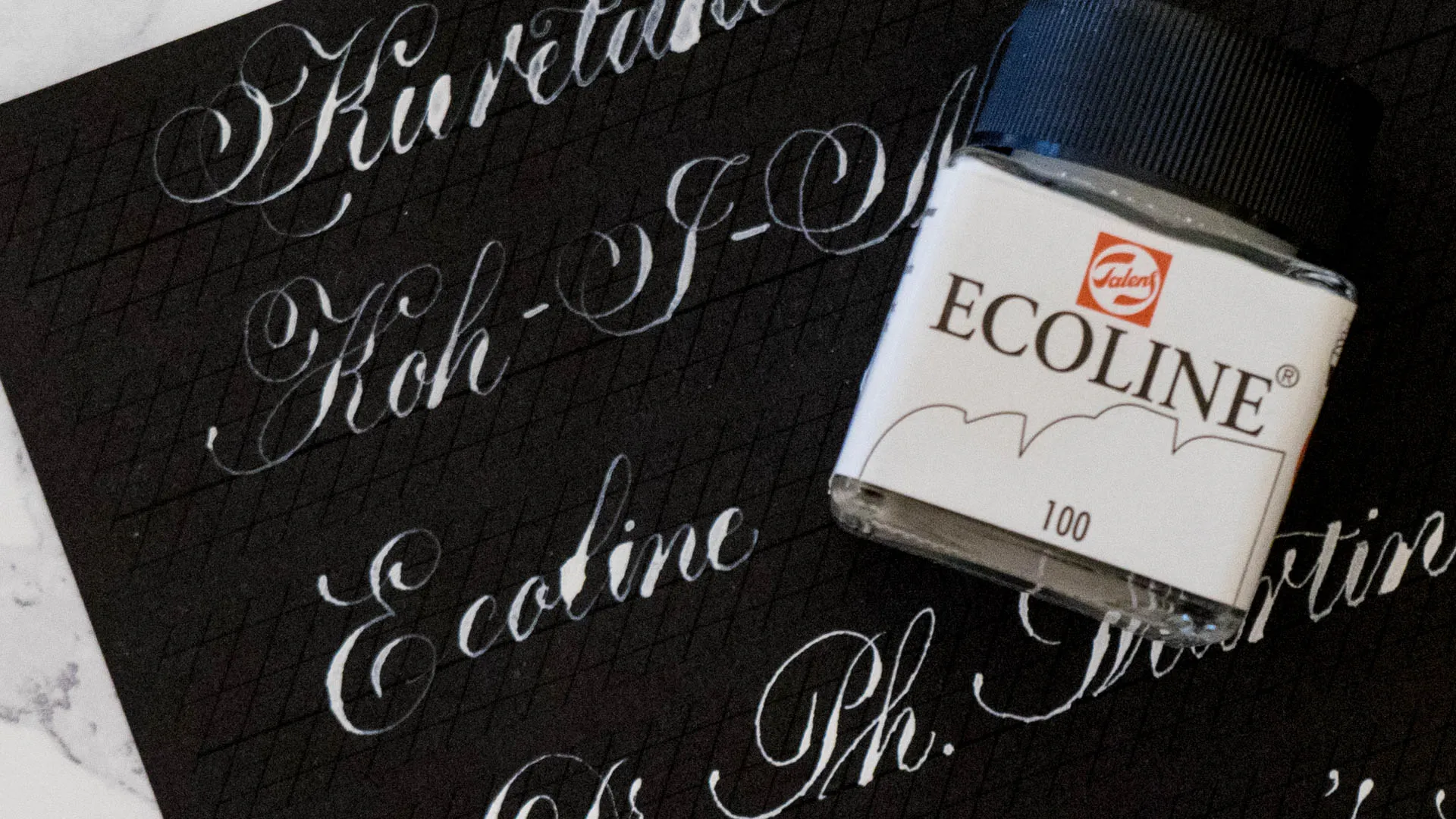
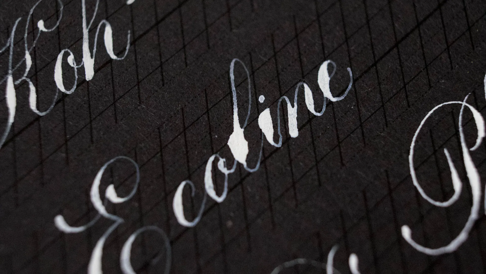
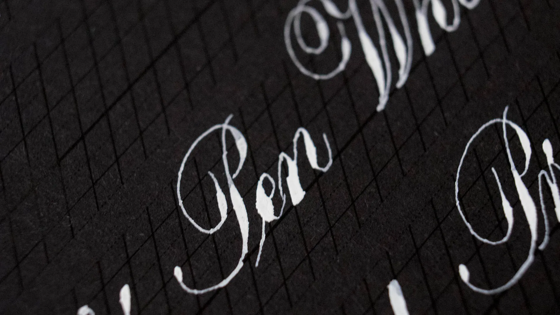
Dr. Ph. Martin’s Pen White
Dr. Ph. Martin’s Pen White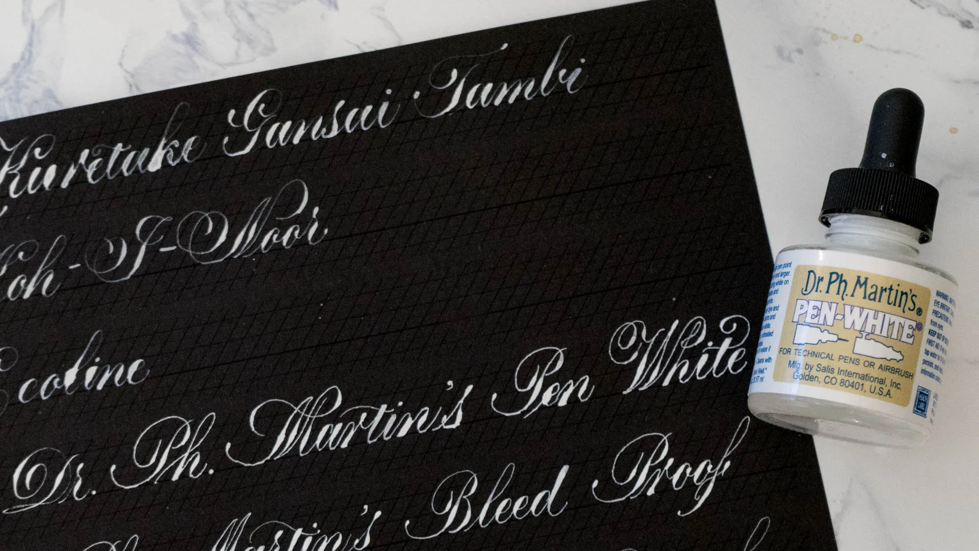

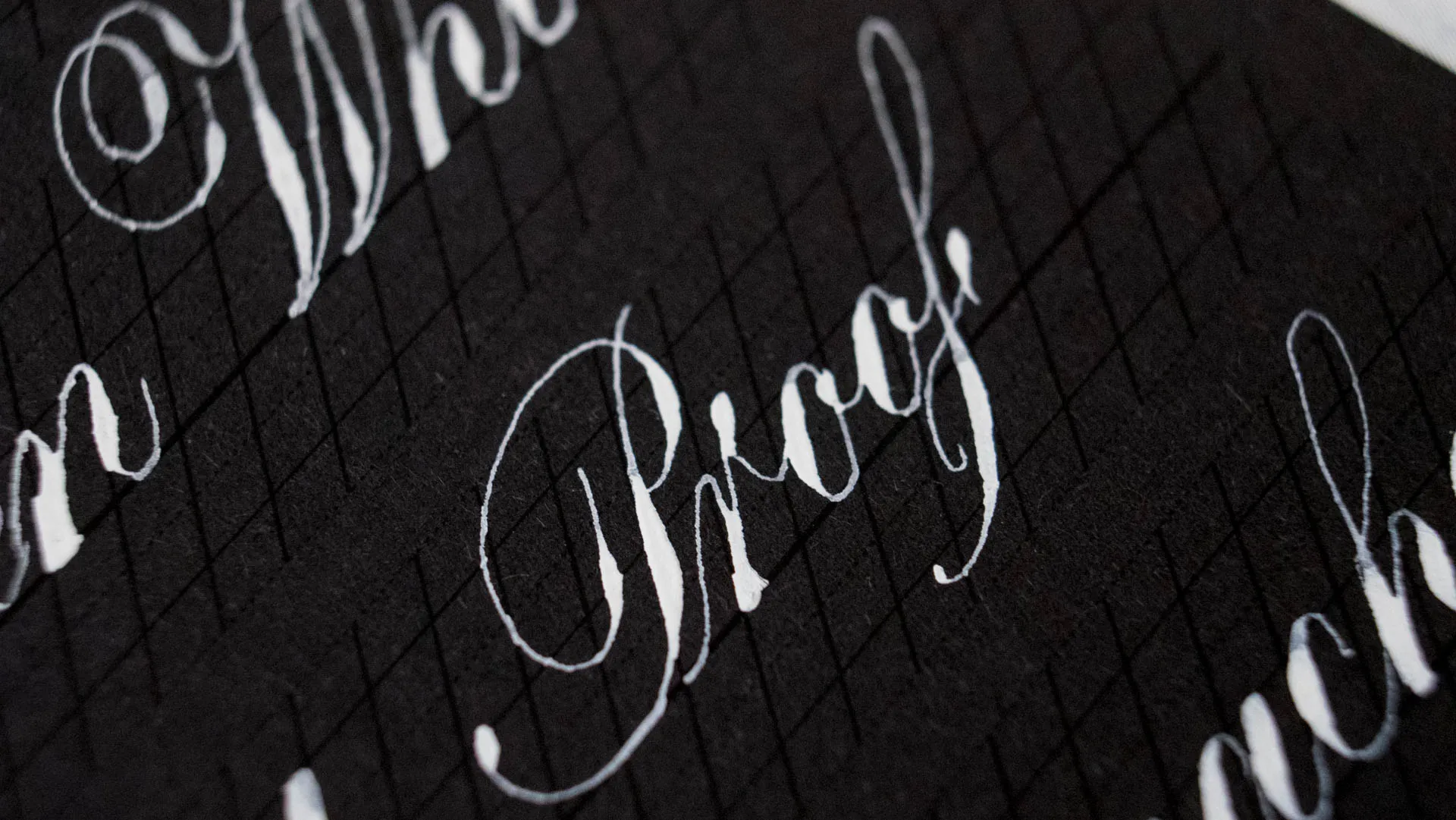
Dr. Ph. Martin’s Bleed Proof White
Dr. Ph. Martin’s Bleed Proof White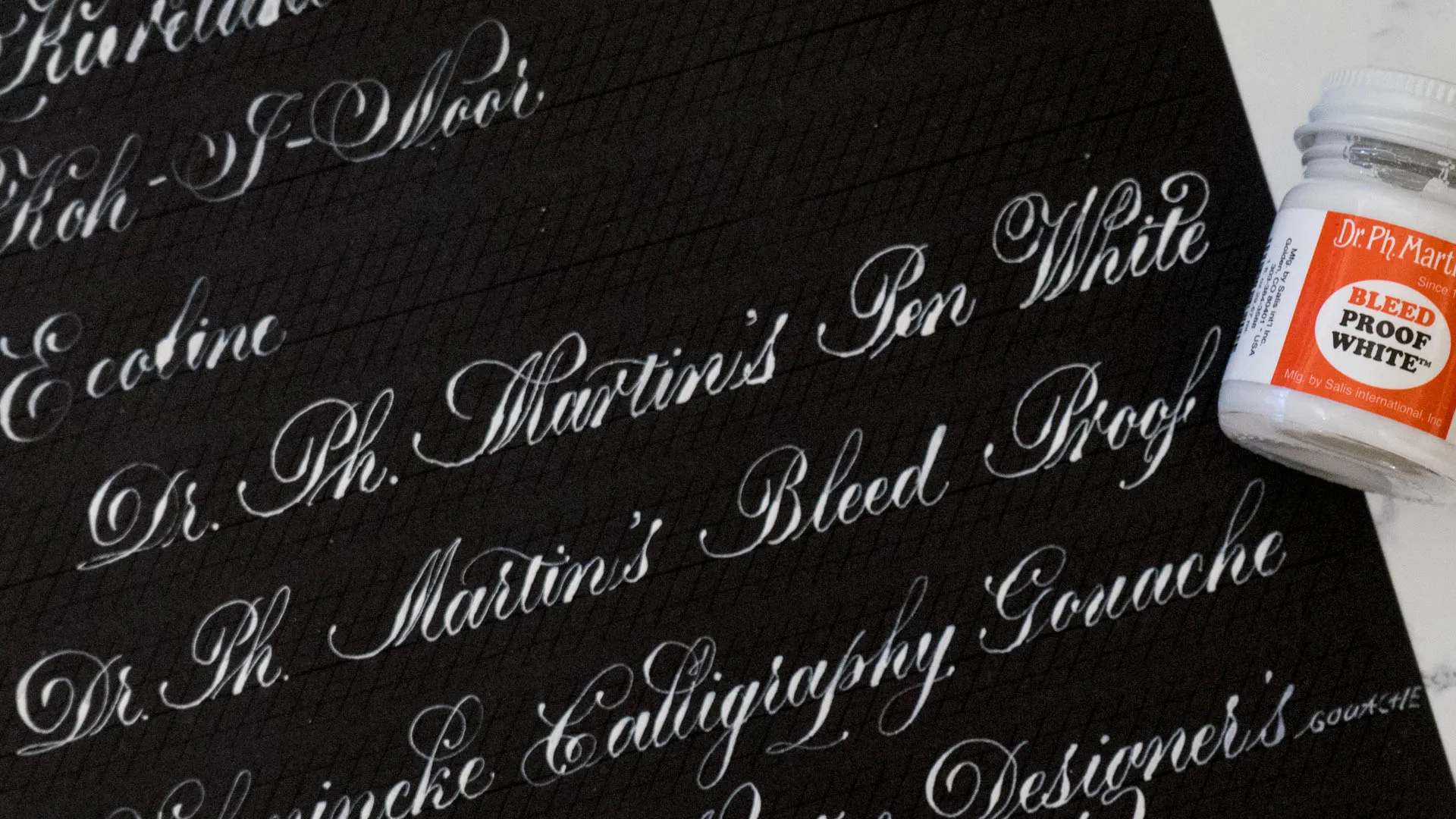
Okay, so this apparently is the Holy Grail of lots and lots of calligraphers. As mentioned above, I hadn’t gotten this forever because I just couldn’t believe that it was any good, after hating Pen White so much, but after I posted about my Schmincke Gouache and mentioned it in my caption lots of people who’s calligraphy I admire a lot urged me to get it and give it a try, so try I did and I did fall in love. A little bit at least. This is really really thick, so no way can you write with it out of the jar, but I prefer it to Pen White, since I do need to dilute pen white too, and I am more used to consistencies like BPW and thus find it easier to mix up at the right consistency with adding paint and water once and nailing the ratio (it’s one of the only things I can get accurate by now, so I am just a little proud of this haha). It is very opaque, the only downside to this is the fact it is very very very fast drying, aka it gunks up the nib. This is worse than sumi, it really forms a crust on the nib, luckily it cleans up really well but it just means you lose time cleaning with it.
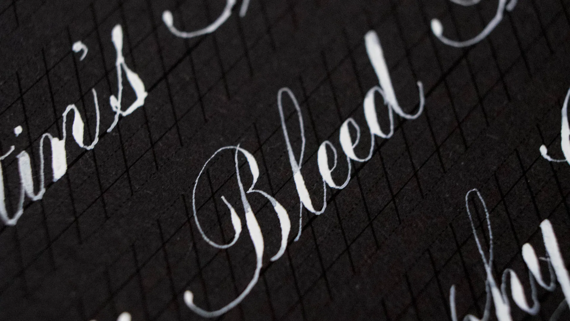
Schmincke Calligraphy Gouache Suprawhite
Schmincke Calligraphy Gouache Suprawhite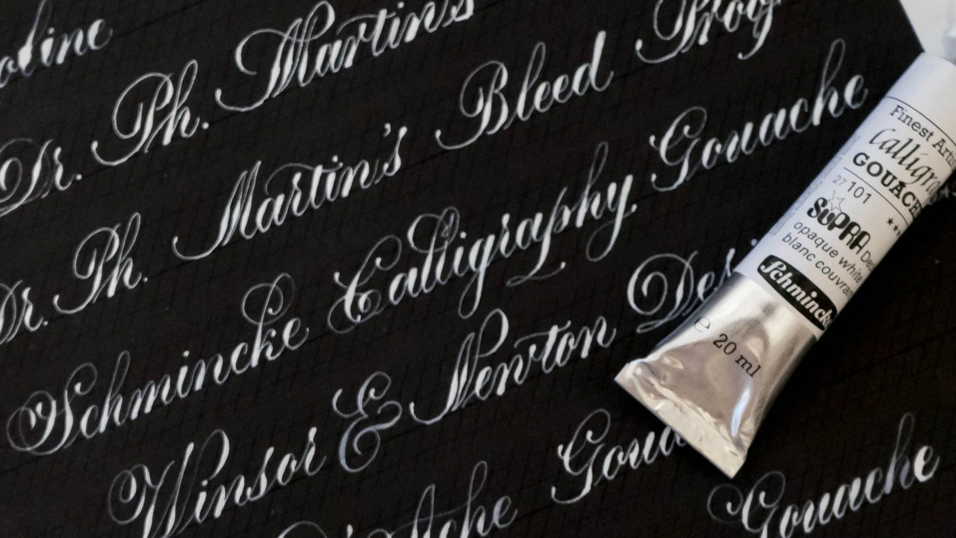
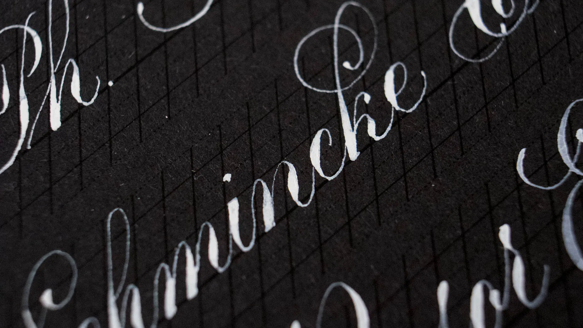
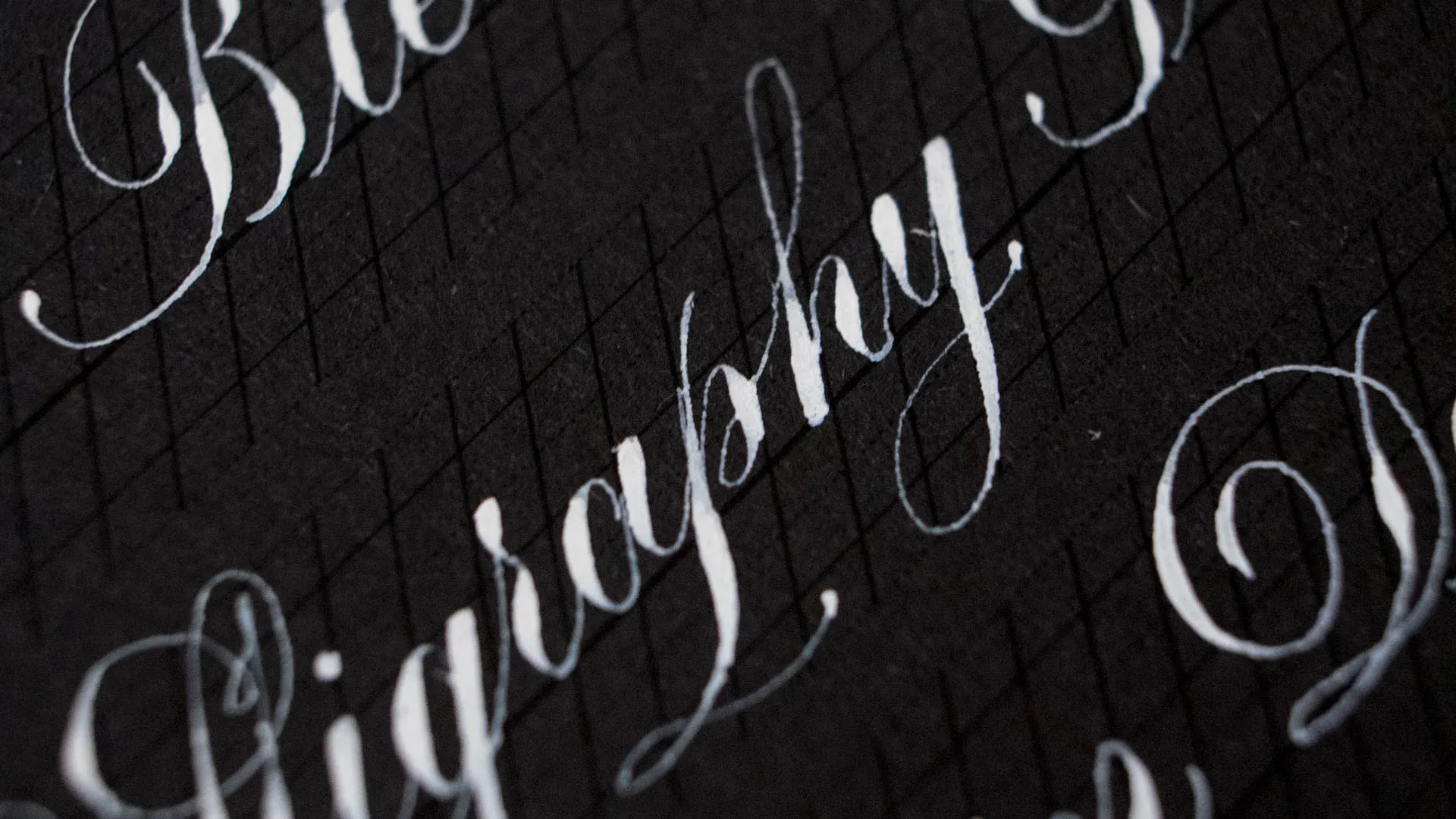
This is the ink that started this whole idea of doing a comparison and a smackdown. When I got a set of the Schmincke Calligraphy Gouache for Christmas I fell in love with those paints, instantly. You guys probably know by now Gouache is my favorite kind of ink for anything, because it is so smooth and opaque and easy to clean and just a dream to work with. The Calligraphy Gouache line was developed with a Calligrapher thus it is very very high in pigment when diluted and this white is incredible. It is very thick and highly concentrated, this is probably the thickest paint I own so you just need the tiniest bit (I mean scooping up with the tip of a toothpick and filling more than a whole line with it) which means this is probably the tube that will last you longest. In terms of price it might come out on top when you buy it as a single, but it sure is worth every penny.
Winsor & Newton Designer’s Gouache Permanent White
Winsor & Newton Designer’s Gouache Permanent White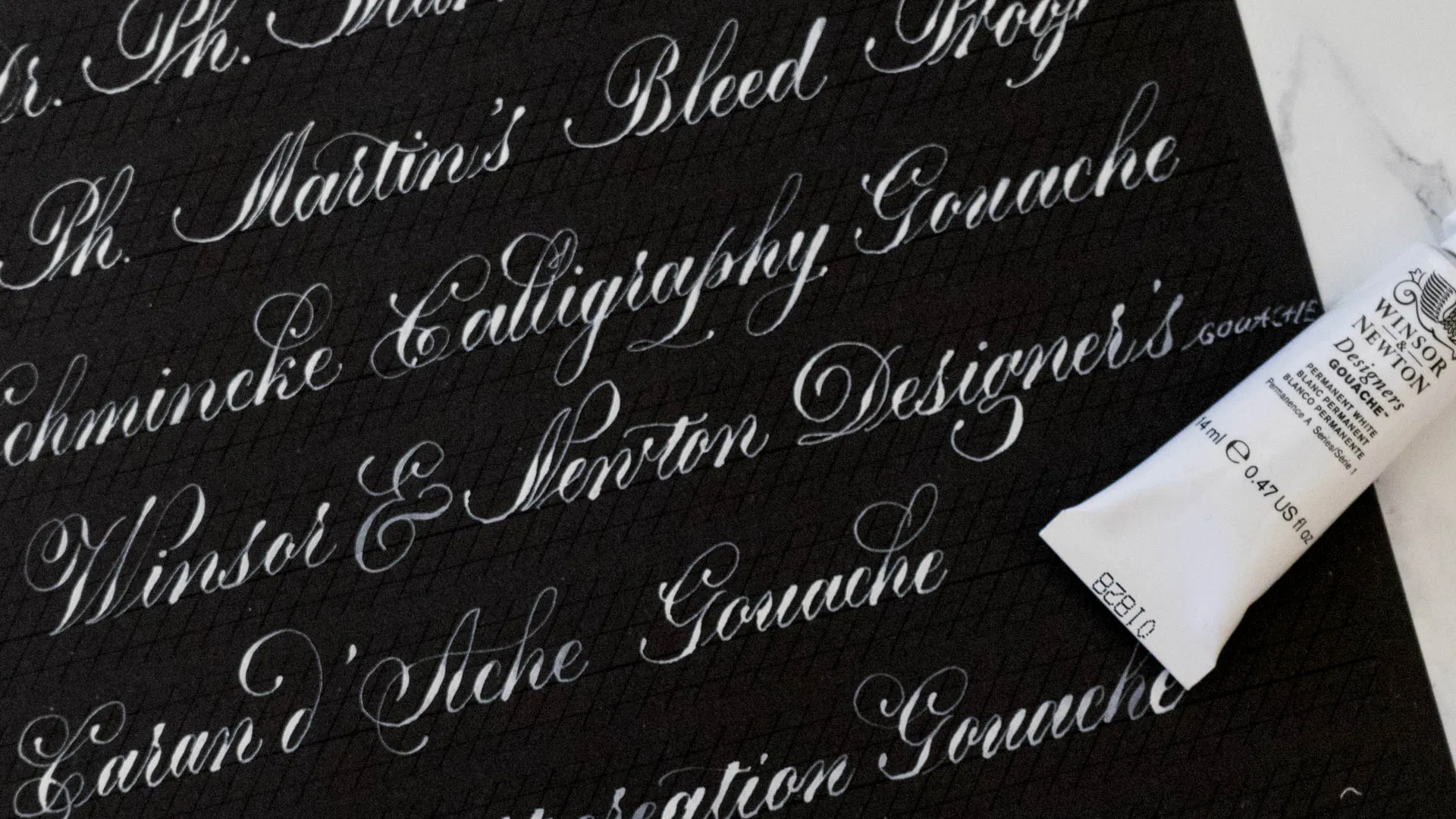
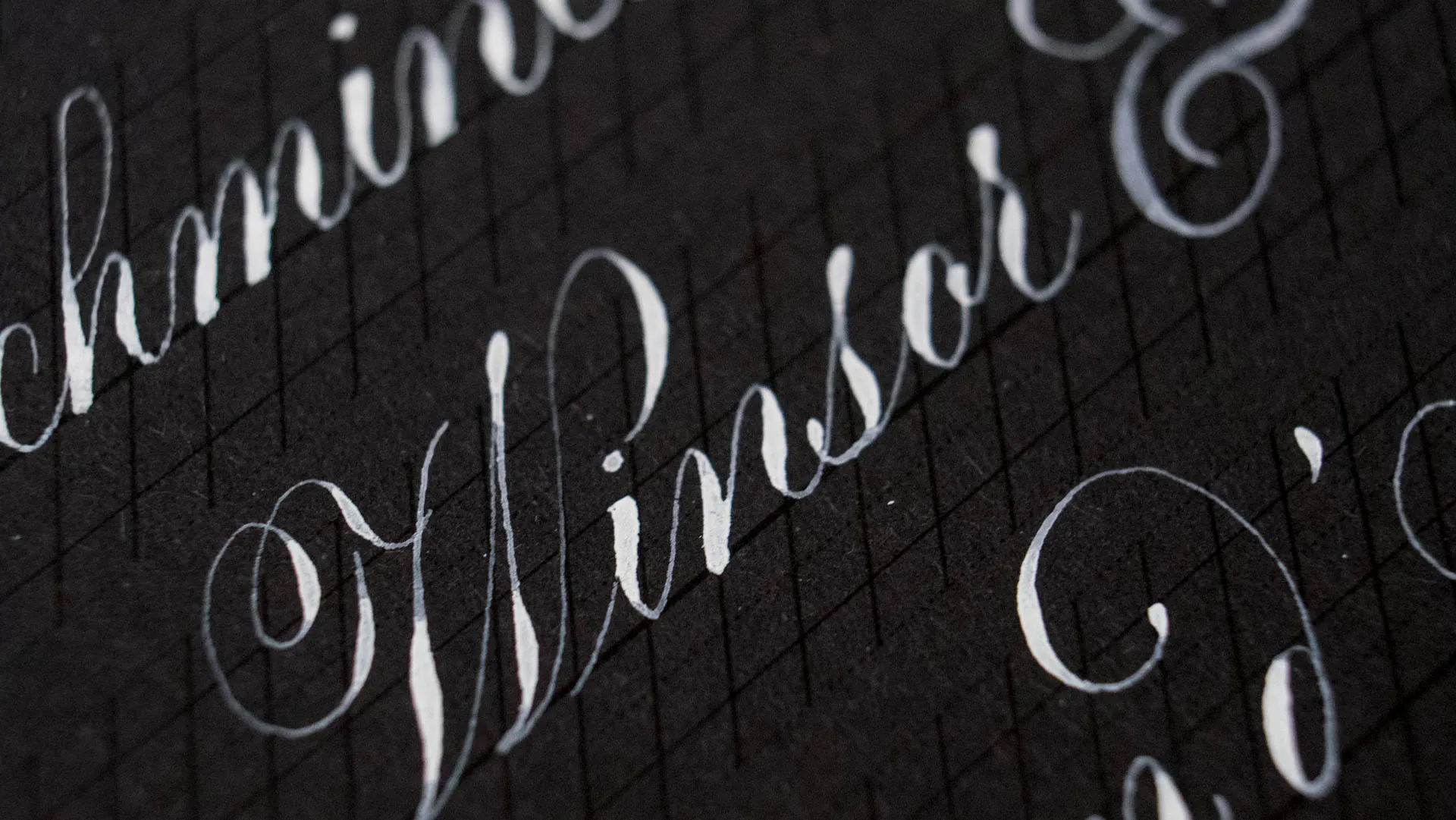
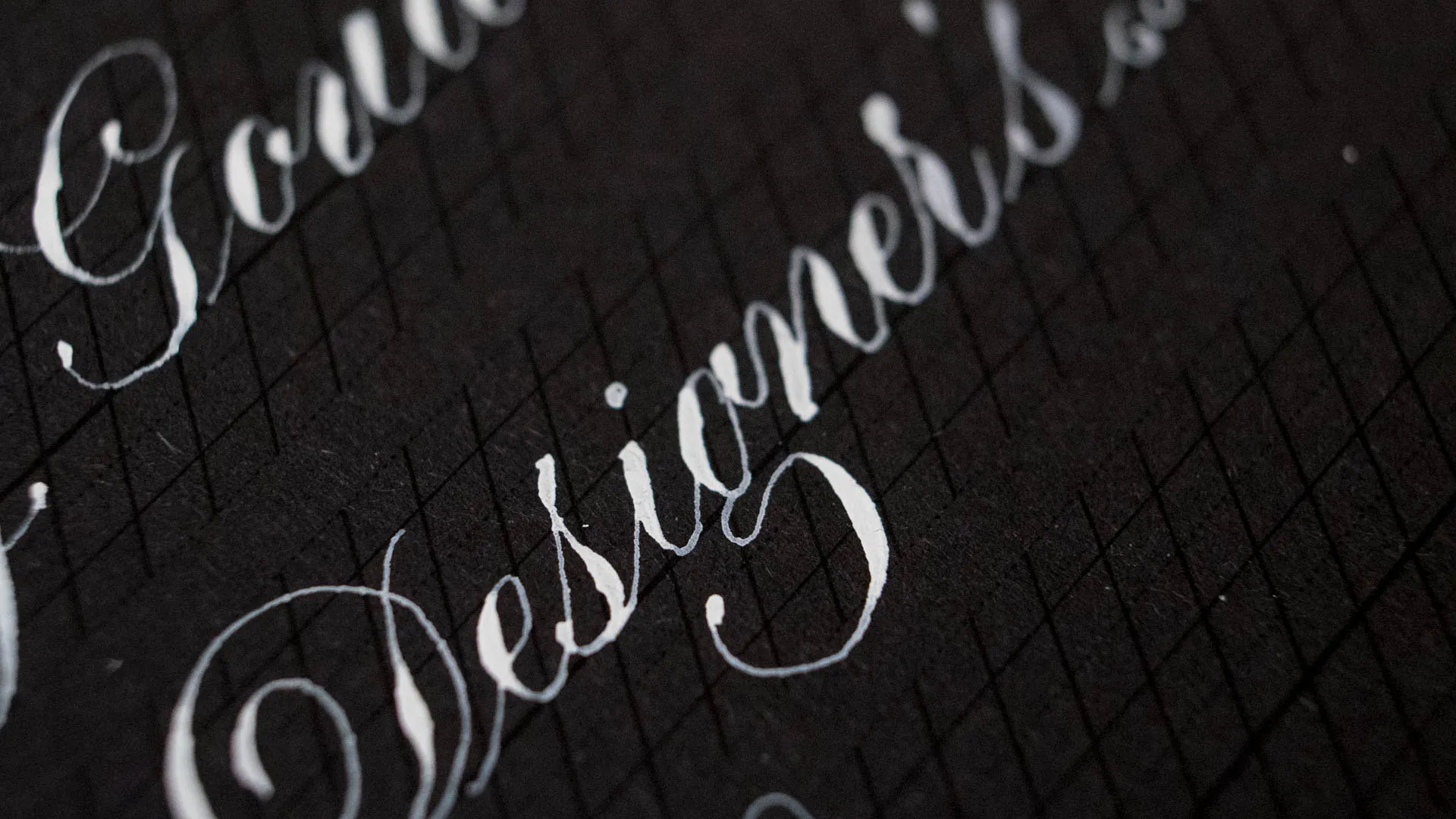
I just recently discovered the joy that is Winsor & Newton Designer’s Gouache. These are weirdly hard to find in Switzerland, despite the fact we have Winsor and Newton here, but thank God for the internet. Opera Rose has a permanent place in my heart, so I just needed to try the White Gouache. It is not bad. At the consistency I like it is not able to cover completely but it is fairly opaque and flows nicely. I think if you use it a bit thicker you might get some fairly decent coverage from it. It most definitely is powerful enough to mix nice pastel colors though.
Caran d’Ache Gouache Deckweiss
Caran d’Ache Gouache Deckweiss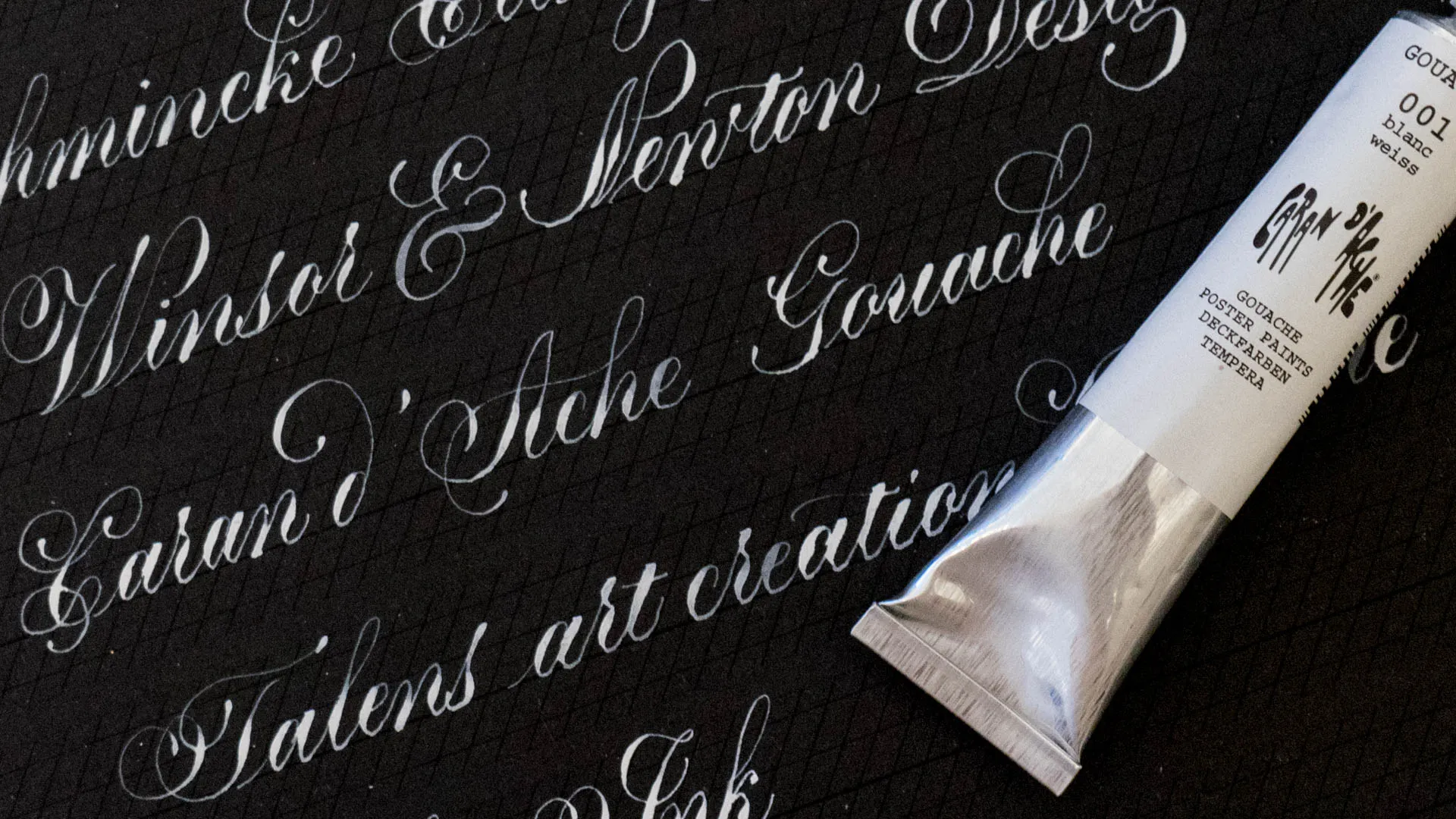
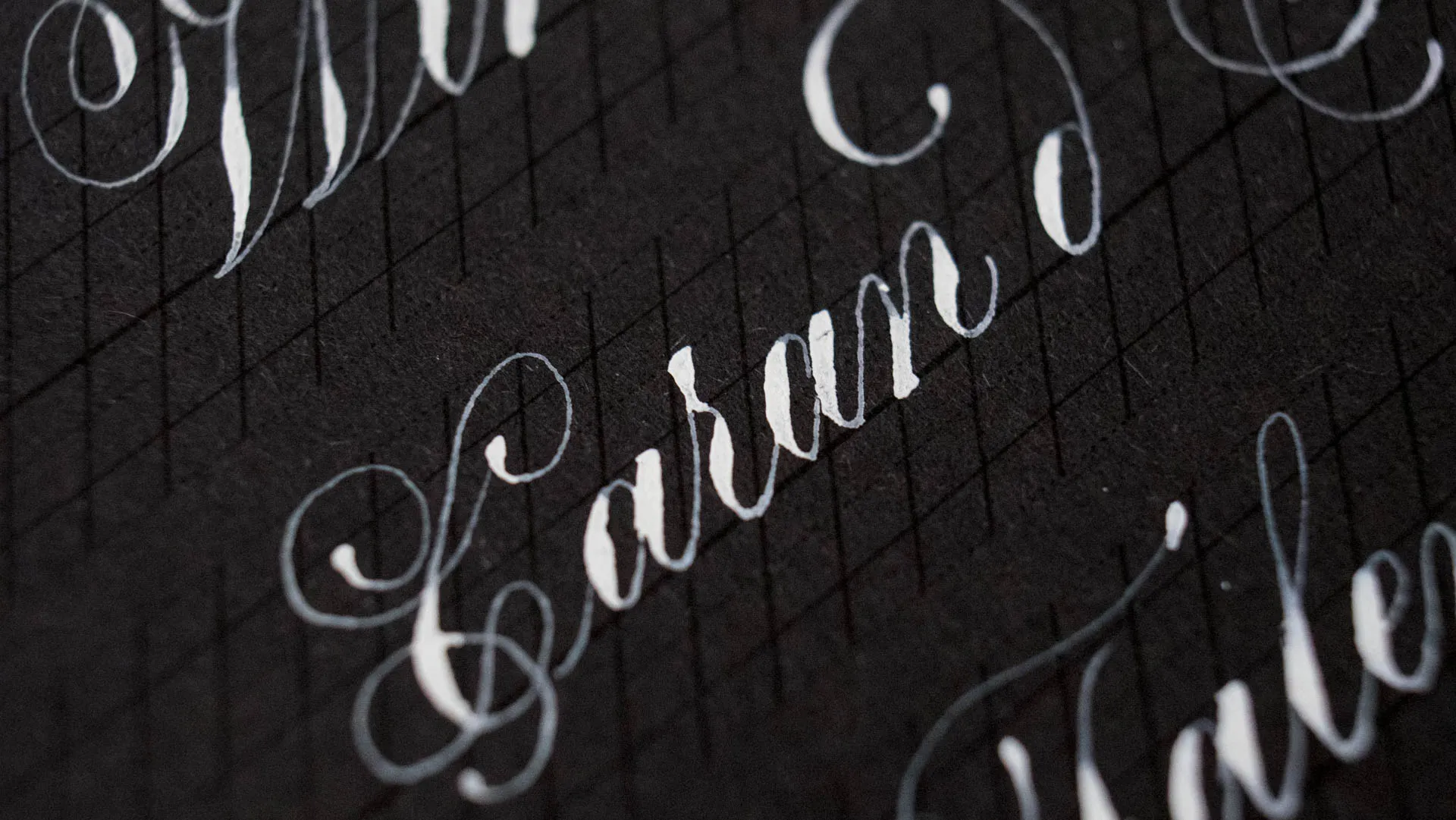
Caran d’Ache Gouache is the oldest art supply I own. I showed you the pan set I used in School in my black ink post, the pan form is amongst my favorite Gouache to use, especially for the price these come in. I think this large tube cost me 3CHF (roughly $3) which is a great price. In terms of consistency it is very similar to the Winsor and Newton and I’d say it’s just a tiny bit less opaque. It works great to mix with colors and used a bit thicker can get almost completely opaque. It has been my go-to white before I got Schmincke, and I still like it. Especially for its price point.
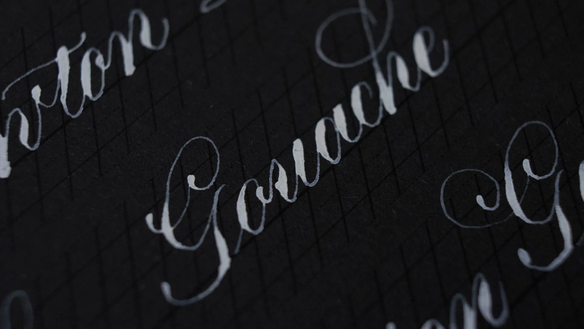
Talens Art Creation Gouache White
Talens Art Creation Gouache White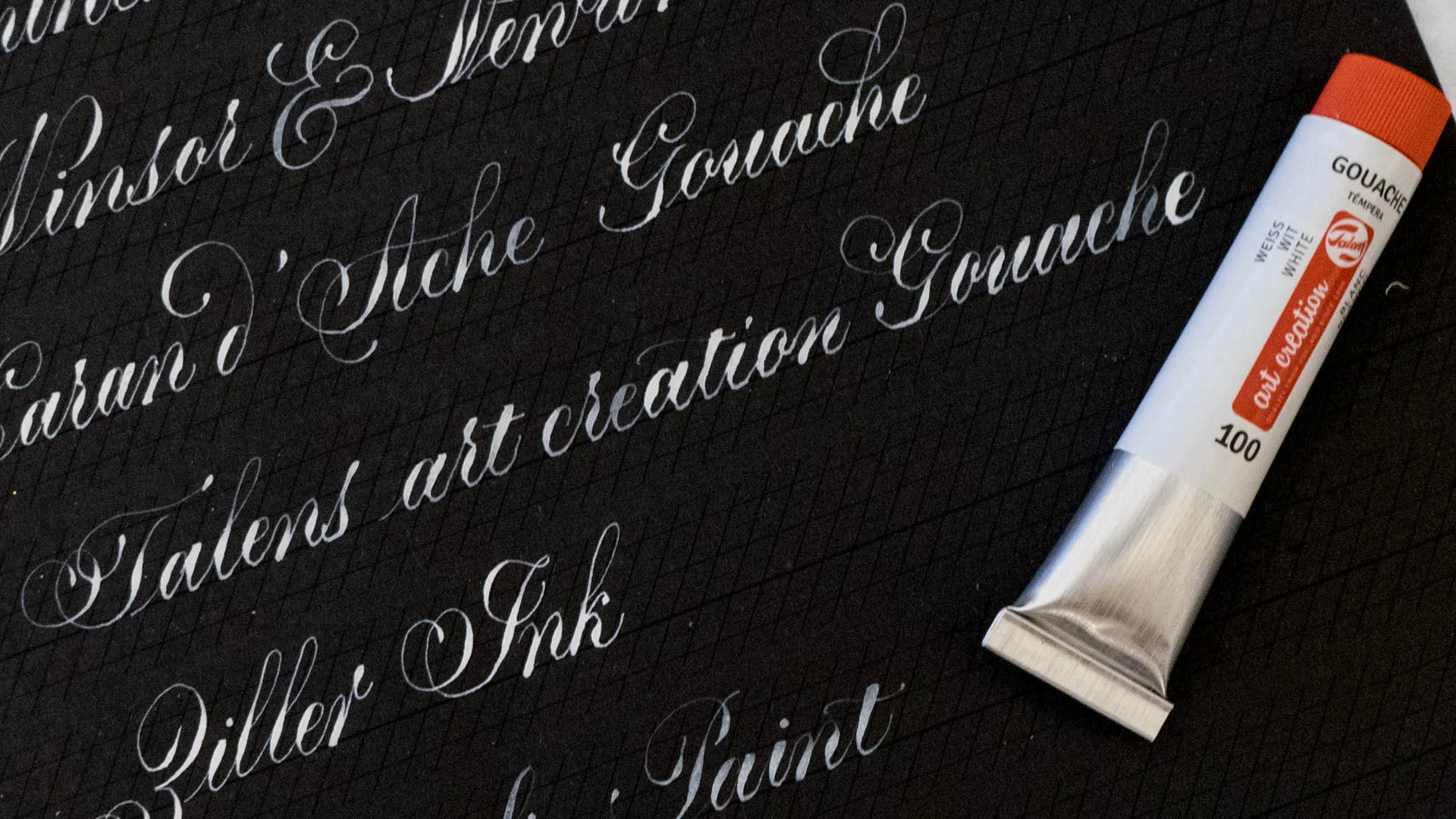
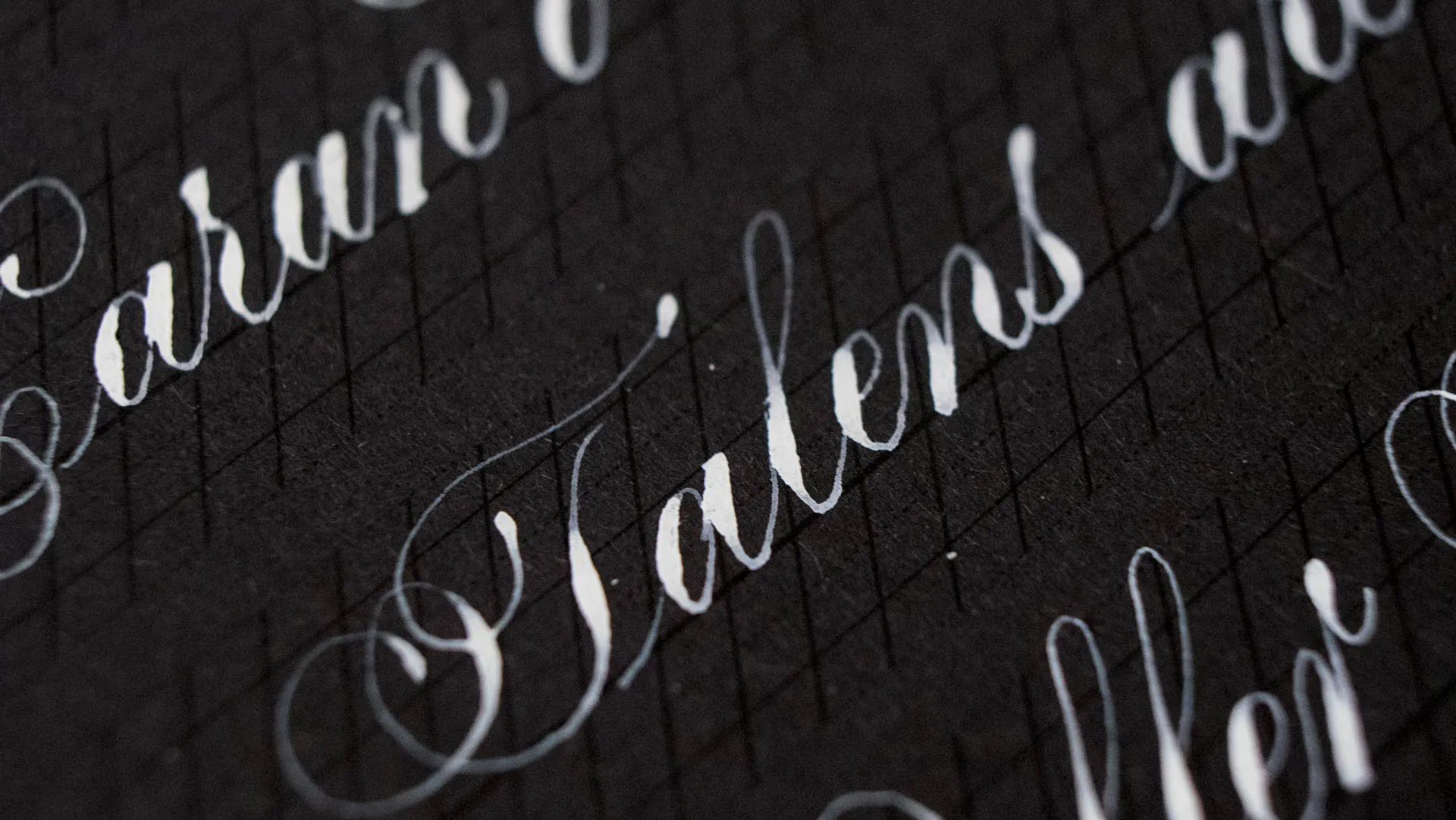
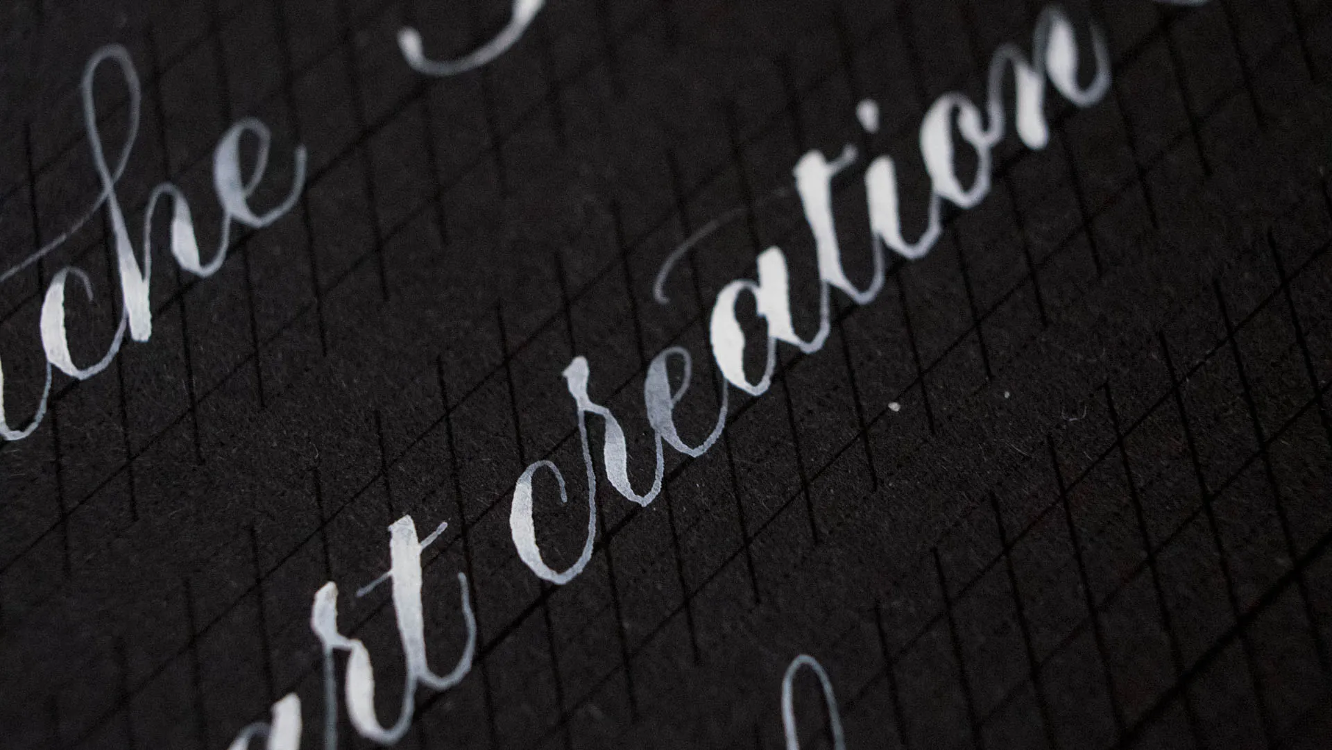
I do not like this Gouache. There, I said it. I got this set of 24 colors and payed like 14 CHF for it, so I was not expecting a lot. I usually am a big Talens Fan (they are the maker of Ecoline) but these paints were a big disappointment for me because they are super super chalky and don’t even cover on white paper. I still wanted to show it to you. As you can see, Gouache is not all equal. Even though as per definition Gouache is opaque watercolor, that does not mean it is able to cover up black.
Ziller Ink North Wind White
Ziller Ink North Wind White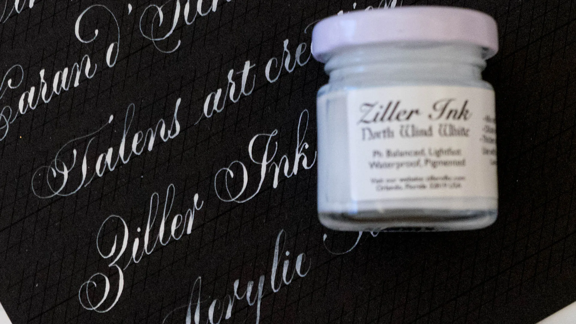
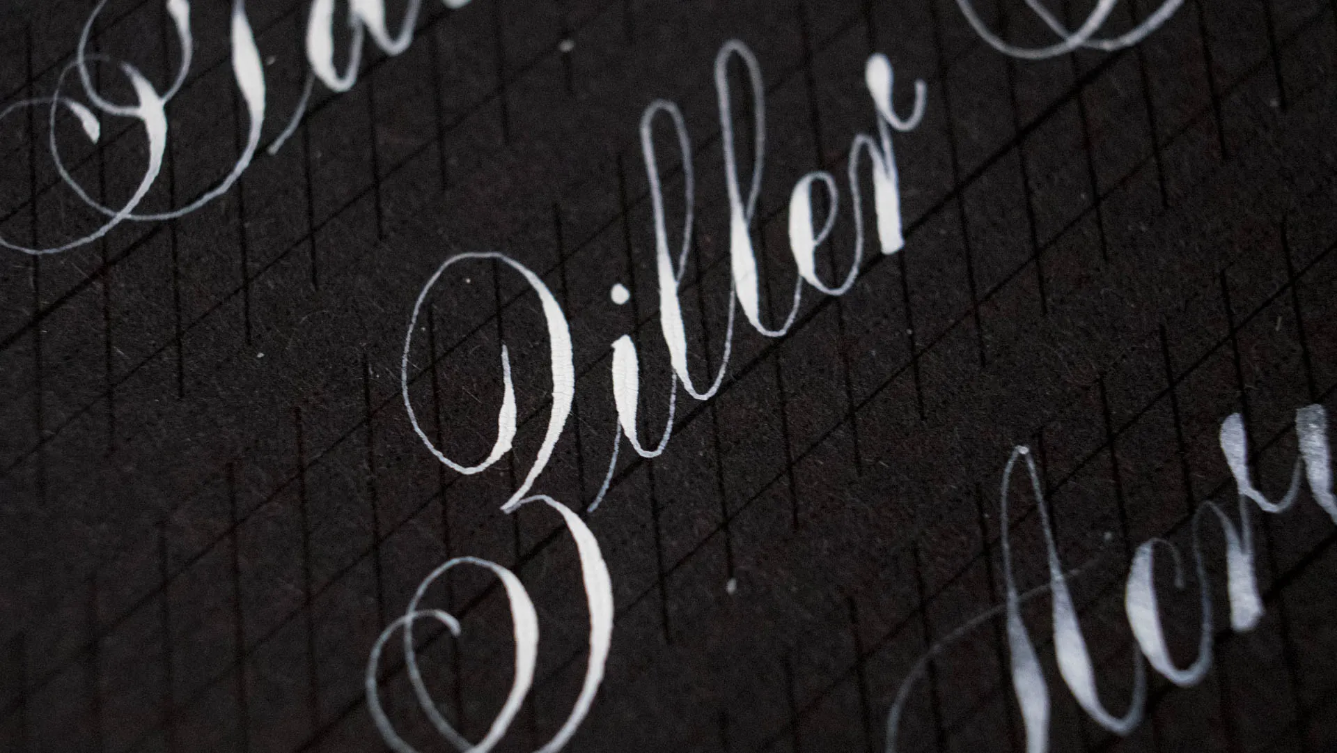
Okay, I think I mention that I hate acrylic ink in every post that I write about ink… well I don’t hate this. In fact, I am actually considering ordering the periwinkle and lavender shades of this ink. I heard a lot of good things about Ziller Ink but I always kind of shied away from them because they are acrylic. But the fact that they sell a thickener kinda made me hope. It made me hope for hairlines that I didn’t hate. And that’s what I got. Ziller needs to be stirred and then it actually has a consistency I like to use out of the bottle. It still is a n acrylic ink though so it comes with all the problems I complain about constantly. Hard to clean off the nib (incredibly hard!) and it gunks. Nib cleaning necessary. This White is not 100% opaque and what I do not like about it is the fact that it cracks a bit on the shades, in the middle it’ll form like a valley with tiny fractures coming out of it. Not the biggest fan of that. But it has one very very big advantage over the other inks shown here. Acrylic ink is waterproof. So if you are putting an address on an envelope or doing placecards that might be outside, this might be the best option because if won’t wash away, even if your paper is soaked.
My Top 3
My Top 3I’m pretty sure you’ll be able to guess from the little reviews, if not, here we go.
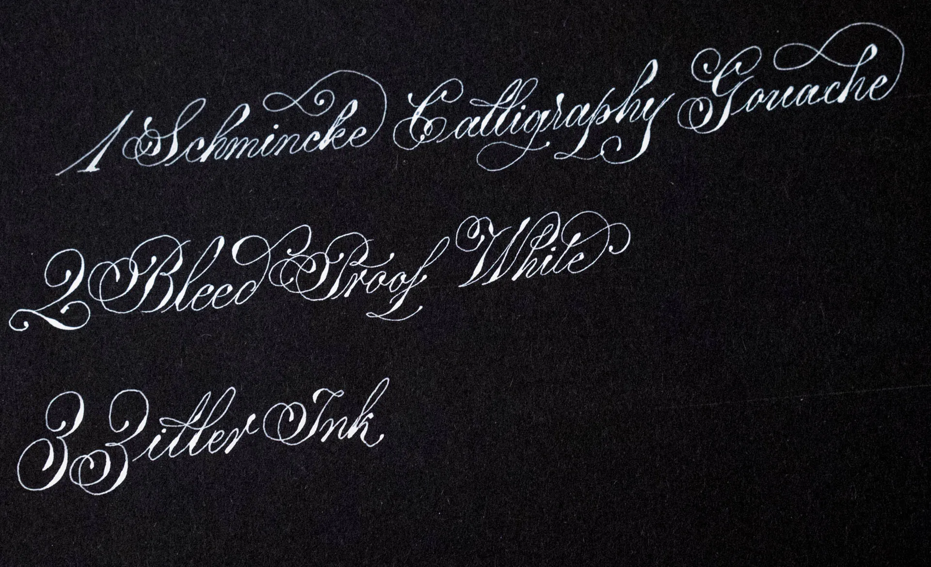
3. Ziller
3. Ziller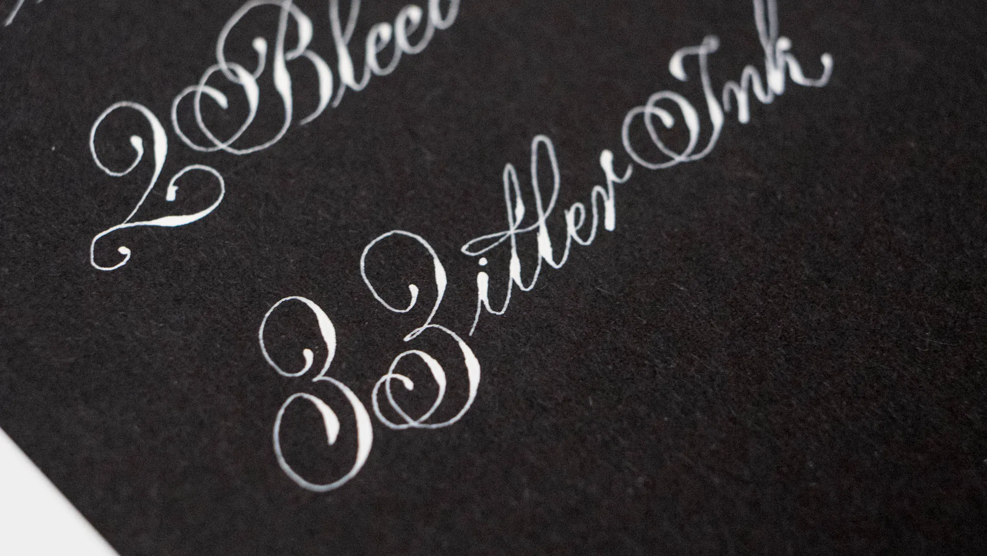
This is a pretty big deal for me, naming an acrylic ink in a third place on any list that has top or best in it. I do like it. I like the convenience of it being waterproof and working out of the bottle. I don’t like the cracking and the hard to clean part, but I can look beyond that if I have to. Overall a very good choice.
2. BPW
2. BPW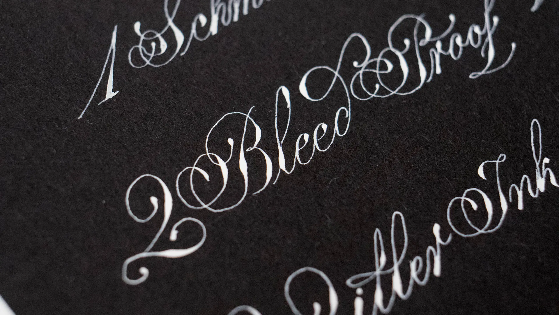
Shocker, it is not first. I do really (and I mean really!) like this ink. But I think the fast drying aspect of it makes it a bit of a nuisance to use over a longer period of time. So it can’t land on place 1.
1. Schmincke
1. Schmincke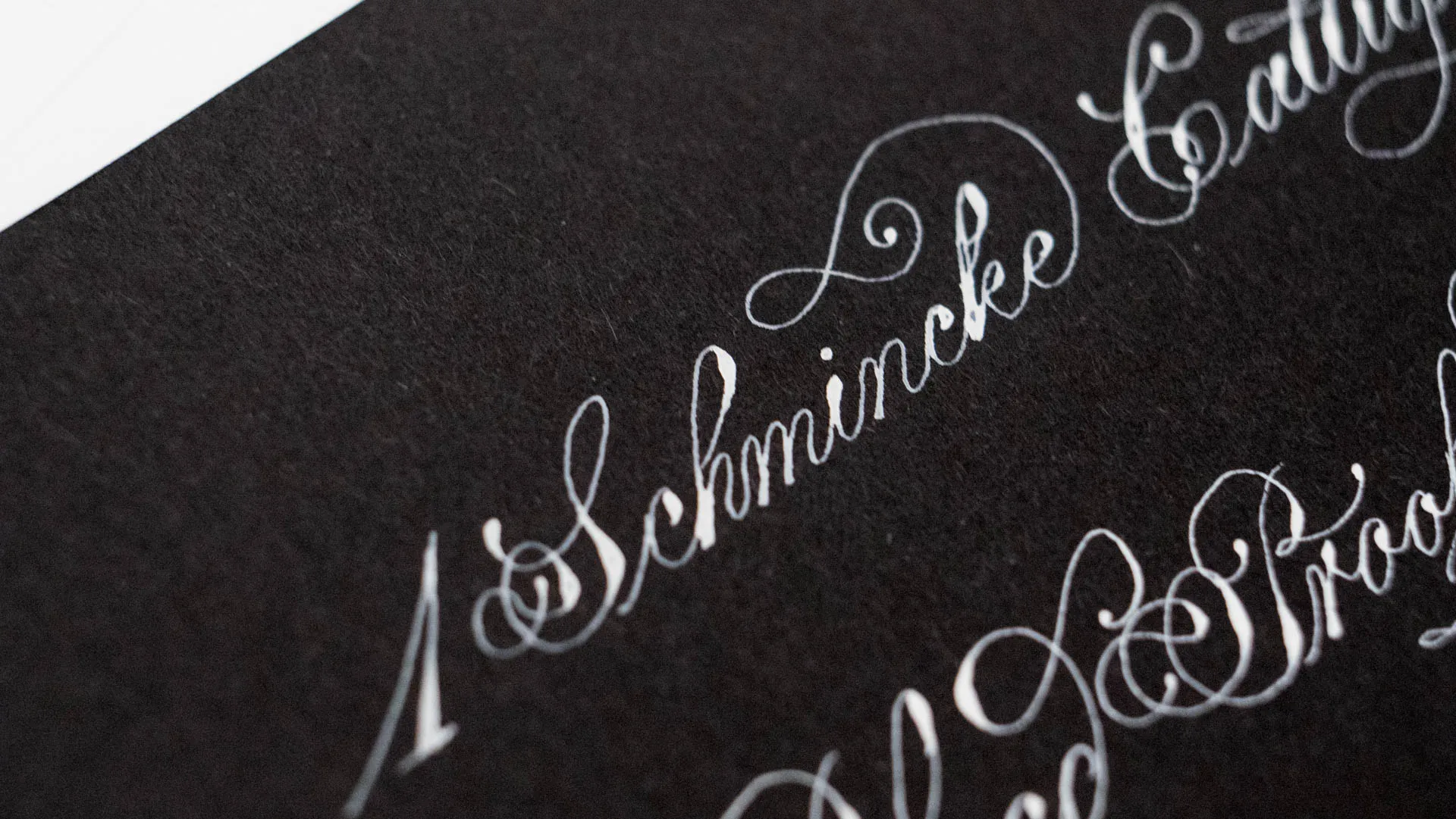
It is so easy to use, so smooth, very opaque and just a pure joy to use. I can’t say enough how much I adore this ink. All of the Calligraphy Gouaches are fantastic, but this one is my favorite.
Those are my Faves, which one is your weapon of choice?
Those are my Faves, which one is your weapon of choice?Let me know, is your favorite in the list? Is there an ink I really need to try?
