I like vectorizing, even though I haven’t done it in a while. I really fell in love with the Pen tool, when I made my font almost two years ago (aka, when I hadn’t actually learned how to letter yet) but I haven’t really done a lot of vector work since then because I very rarely feel the need to vectorize. The thing is, if I want to create work for print I create my piece at a very high resolution in the first place thus I don’t have to save any piece from being pixelated. And since I’ll usually create production work on the iPad anyways which comes with an “embedded cleanup” I feel like I’m good. I’ll do vectorizing for my wax seal designs, but these are usually done very quickly since they are being etched so small. So bear in mind that I am rusty. However, I asked if you guys wanted a post on this on Instagram and you voted yes. So here it is. The vectorizing tool smackdown!
I did these in Adobe Illustrator CC 2018, but all of these tools have been around forever, so older version should work as well.
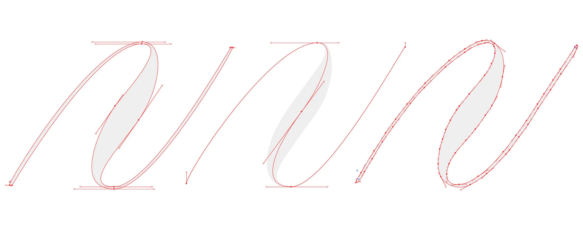
The Contestants
The ContestantsImagetrace + Smooth Tool
Imagetrace + Smooth ToolSo you guys know I don’t like image trace. I personally just like being in control of where I put my path points. And - as a front end dev - I do actually read the output of my vector files, because when I vector it’s usually because I want to take some work online and do fun/simple stuff with CSS to it.
However, because I know you guys will want to look at it - I did do a very quick image trace and smooth tool, and it did come out alright, since my stroke was black on white with no guidelines.
Because sometimes Image Trace is all we have time (or nerves) for - always make sure to get a good source image. Work in black only, do erase or remove all guidelines, scan it, transfer from iPad or take a picture whith a scan app, making sure no distortion happens, if you go the picture or scan app route, you might have to do some contrast work in photoshop before. Always use the black and white preset and ignore white to save yourself time. Fun fact, I will actually use image trace to create my vinyl sometimes from the iPad Lettering, just so I can add a quick stroke and ensure my hairlines aren’t going to break. Since I usually work at a very high resolution and will be cutting a fairly small file image trace with a quick smoothing will get the job done.
Pen Tool + Width Tool
Pen Tool + Width ToolSo this is the main reason why I asked about this in the first place. I was not aware of this tool (despite the fact I’ve known and used Illustrator for years, just slightly embarassing) which allows you to apply variable stroke width. I learned about this tool, because I asked my vector Idol @heypenman how he was able to have variable widths in his strokes. He told me that there was such a thing as the width tool and yes, you are seeing my very first attempt at this, which explains why it might look quite messy and also results in more points than I’d like. Basically you draw one single stroke instead of an outline and will then add weight using the pen tool. I feel like this is a lot more of a Calligraphy approach to a vector than the lettering, outlining approach I’ve been taking with just the pen tool.
Pen Tool only
Pen Tool onlyThis is a very common way of vectorizing and I feel like a lot of people take this route, you basically create an outline of your letter with the pen tool only.
Process
ProcessI don’t go explaining how to vectorize here, this really is supposed to be a quick comparison. Both methods work very similarly how you place your points, you want to find the turning points and preferably work with mostly horizontal and vertical anchors, however sometimes angled points are necessary, to get a smoother curve. If you have never worked with the pen tool, there is this wonderful game called The Bézier Game that’ll help you master the pen tool while having fun and finding the eye to reduce pen points. I also love the vectorizing tutorial by Ste Bradbury I haven’t found a really good Tutorial on the width tool, so I might end up making one once I figured it out and am better at using it.
I easily could’ve spent hours more tweaking this, which is always true with vectors, I just decided to stop at a point where I feel like this might work in a pretty small logo-ish version (still looks pretty crappy at a large scale, but I wanted to go with it.)
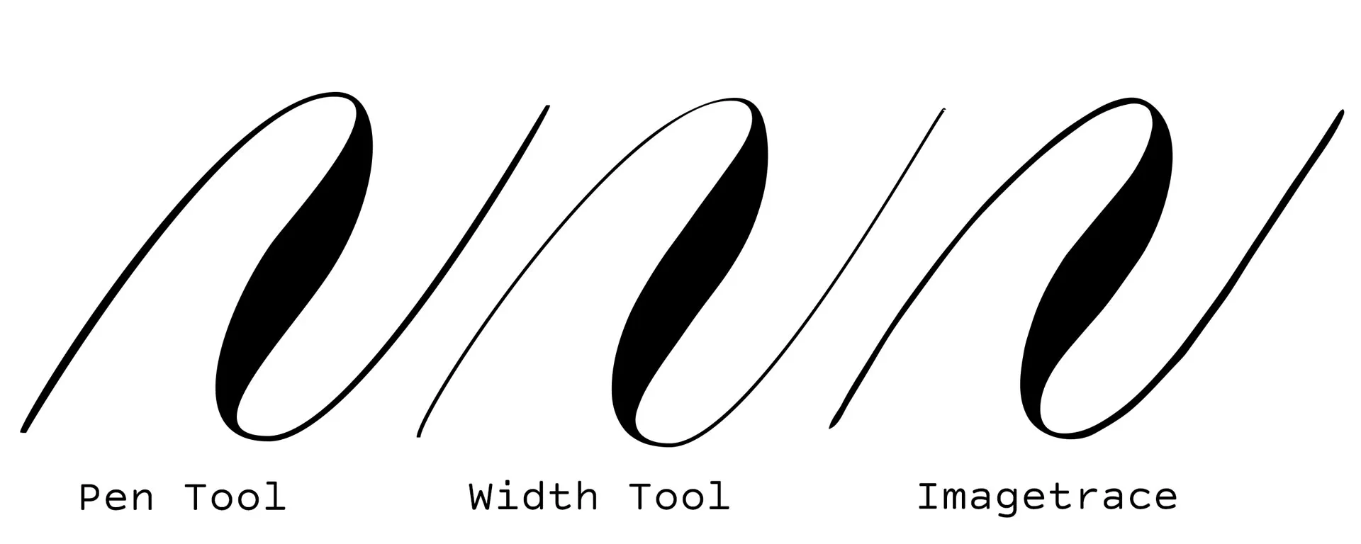
So here are hard facts and end results. Image Trace ~ 3mins Pen Tool ~ 12min (did however include getting guides ready and me blanking out on how to turn paths into guides) Width Tool ~ 13mins
I did screenrecordings, and a very quick speedup of both of these, so in case you have no idea of what this might look like, here we go:
Pen Tool
Pen ToolWidth Tool
Width ToolSmackdown
SmackdownSo here we go, let’s talk about the actual smackdown. Who wins?
Process
ProcessI personally really hate Image Trace processwise, I don’t like playing with sliders and trying to get it at smooth as possible, so even though the process was the shortest I felt least in control, so I don’t like it.
The Pen Tool comes with more of a routine for me, however I feel like the width tool, is extremely powerful once I figure it out a bit more and get a better idea of how it works. I really liked being able to approach my line as one stroke with added weight instead of an outline, I felt less constrained and more free in a way. But if you read my last post, you also know that I do feel more at home with calligraphy than lettering, so this is definitely something new that I do really like.
So right now I felt the most secure and sure of myself with the pen tool, but I had most fun with the width tool, so I’d call it a tie right now.
Looks
LooksIn Terms of looks I really like the width tool hairlines, which you might have guessed if you know me - I adore thin hairlines. However the transitions are not as good as they are with the pen tool, image trace doesn’t look bad if you look at it without the béziers visible, but as soon as you saw those you just kind of hate it from the getgo. I do like the first entrance stroke though, I feel like it is more consistent than my pen tool version.
If I had to choose my favorite I’d say width tool.

Code
CodeOkay, so this might not be something a lot of people would look at, but I just wanted to know. Especially, since I secretly had a hope, even though I already suspected that it won’t work how I wanted it to. So you might have seen fun line animations, at one point somewhere and I was really hoping, that since the width tool works as a stroke in Illustrator, exporting as svg might somehow reveal a secret of svg I had not yet heard of, but I have to disappoint. Line Animations require a stroke and strokes are not variable in SVG Code. Illustrator’s SVG export will actually outline the path and create a filled shape for you. In other words, the result of the stroke with looks cleanest and fastest curve-wise, actually ended up giving me the largest svg file and the least pretty code. Not really surprising considering how many points I played with to get the width I wanted. I feel like if you go and learn to tweak it you’ll be able to create weight the same way you do it with the pen tool, however using image trace on a circle will usually not yield the 4 points needed to create it in the first place, so I’m actually pretty sure that if you just care about the code the pen tool is a clear winner.
Conclusion
ConclusionThere are two good vectorizing methods in Adobe Illustrator. Both of them produce better results and paths than image trace, they do however take a bit more time and a lot more practice. Both will result in a shape as an svg export and the width tool will produce messier code than the pen tool used to outline.