Me and black ink have a pretty strong bond and somewhat of a long history. Back in my school days I got/had to use fountain pens every day and I’m gonna be honest, I just never liked the default royal blue. That was before Social Media and before I learned about this wonderfully amazing thing we call Online Shopping so all I knew was a very limited palette of ink, notably Royal Blue (urgh), Dark Green (not allowed in School), Red (loved it, also prohibited), Pink (my top favorite, but also not okay in school) and black (OMG, it’s allowed to use, it’s not freaking royal blue and it’s kinda awesome!). Me and black ink were a pretty big thing and if you look at old notebooks of mine, before all of my dark reds and burgundies and turquoise they are pretty much exclusively written in black. So to say that me and black ink go way back is a bit of an understatement, since it’s basically been with me for most of my life, since I was around 8 years old. But black and me in Calligraphy didn’t have the easiest of starts, because I tried a lot of inks I didn’t like. That has changed now though.
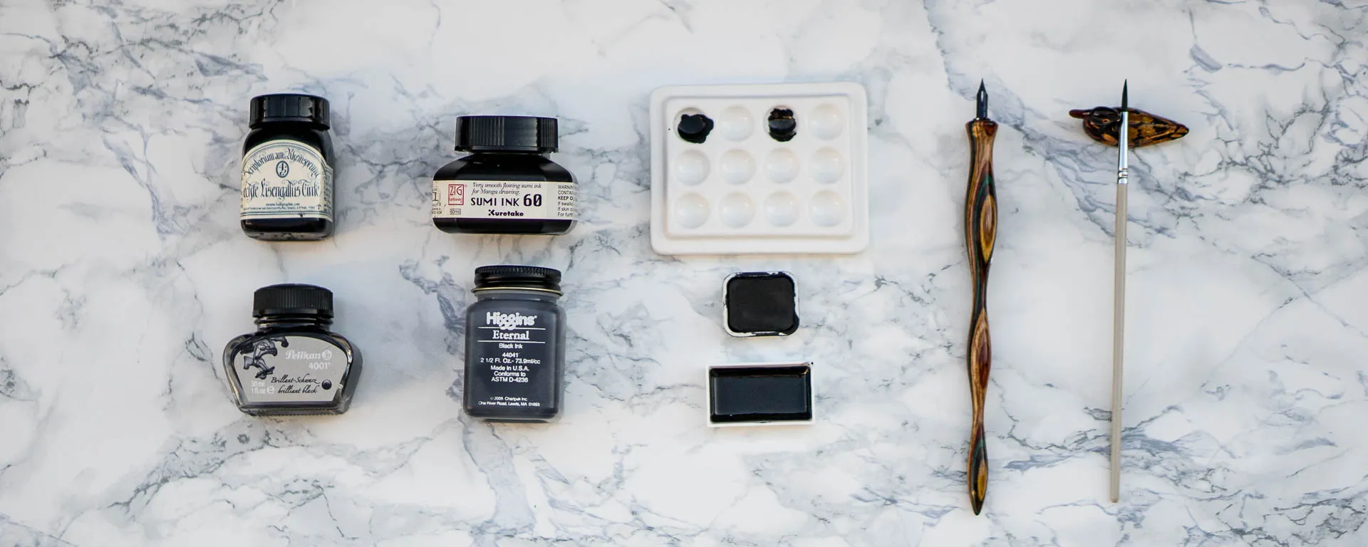
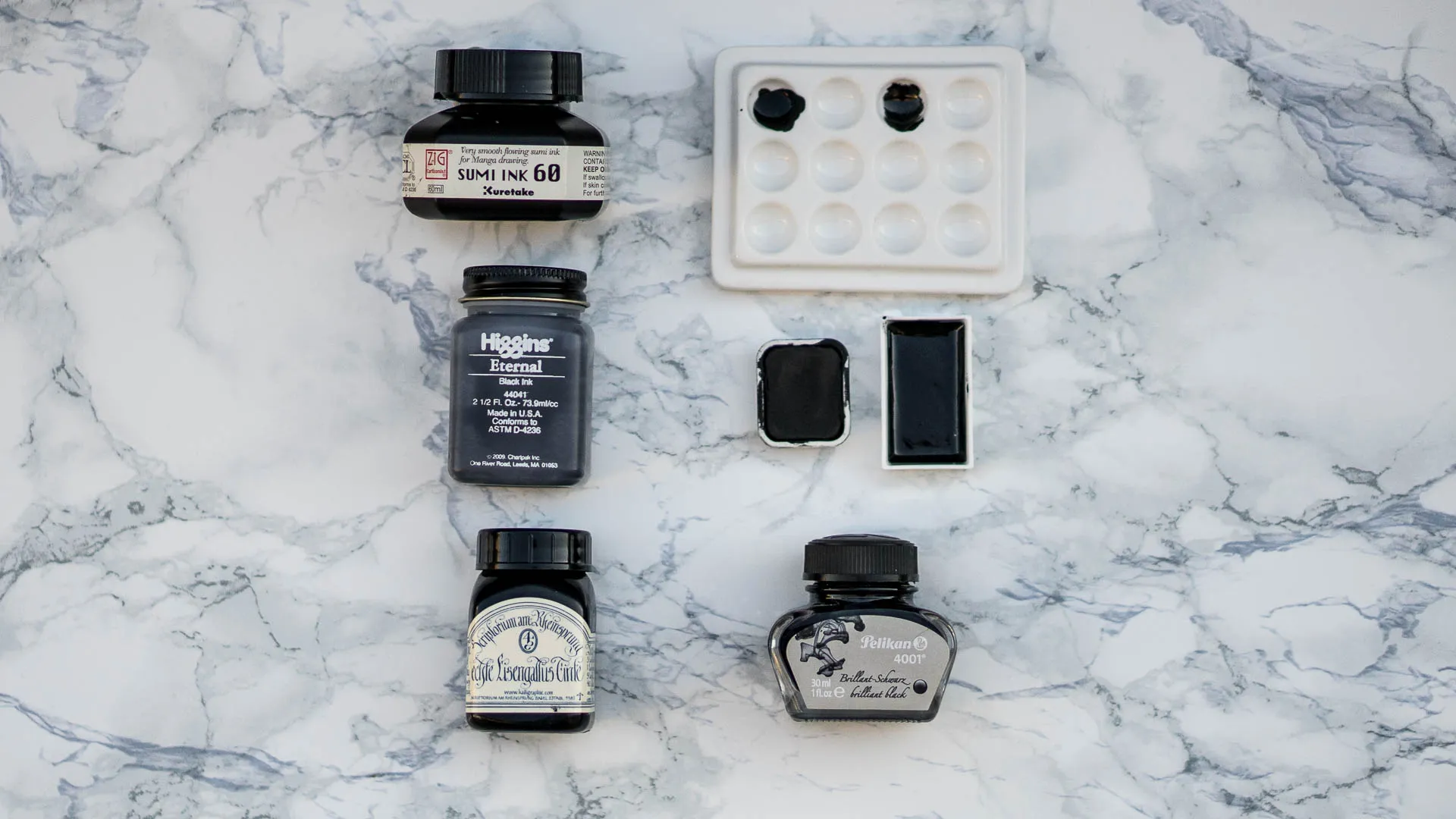
So let’s talk about my Top 5 (alright, it’s 6…) Black inks. But first we’ll dive a bit into different types of inks you can get nowadays and learn all about the differences. When I shared some information about this on Instagram a while ago I was contacted by a few vegans who were a bit surprised but also really thankful because they hadn’t realized that those paints were not animal-product-free. I personally eat meat and am thus not a vegan, but since I know a bunch of people in this lettering community are, this might be helpful to you. And I think it’s generally very interesting.
Table of Contents
Table of Contents- Inks you won’t find in my list
- Different types of Ink
- Let’s talk about the actual list now!
- Number 5: Iron Gall Ink from Scriptorium am Rheinsprung Basel
- Number 4: Pelikan 4001 brilliant black
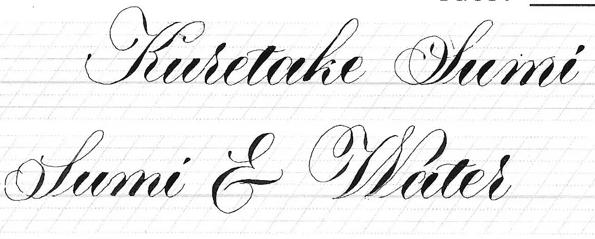
- Number 3: Kuretake Zig Cartoonist Sumi Ink
- Number 2: Caran d’Ache Gouache & Kuretake Gansai Tambi
- Number 1: Higgins Eternal
- That’s all Folks
Inks you won’t find in my list
Inks you won’t find in my listIf you’ve read any of my content on inks and/or talked to me about it you’ll know that I do have a pretty strong opinion on certain types of ink, which I’ve basically completely given up on, I own some but I will not use them if I can avoid them. The inks I do never recommend to anyone are acrylic inks and shellac based inks, since I’ve had bad experiences with those. I do not like them because they tend to be really hard to work with for me, or result in much thicker hairlines, tend to pool in turning points and are overall not enjoyable to use for me.
Different types of Ink
Different types of InkBefore I jump into this I want to talk about the different types of inks that we generally know and use in the Calligraphy and Fountain Pen world and give you a quick rundown of the characteristics of each of the types.
Dye
DyeOkay, this is the reason why the word Fountain Pen is even in that little paragraph up there. Fountain Pen inks are dye based inks, at least most of them. Dyes are colors that fully dissolve in the liquid, they tend to be pretty cheap and rather vibrant, however due to their nature they tend to be less lightfast than other types of inks. One of the disadvantages of dye based inks is that they are usually thinner than other inks and because they don’t really have any “pieces” in them, they tend to imbue the paper a bit more, that means if you don’t have a good coating on your paper, you’ll get some pretty heavy bleeding. That means that dye based inks aren’t the best for Calligraphy if you want to use them with cheap paper or care about lightfastness and permanence. I think there are waterproof dyes but most commonly those inks aren’t either of those two.
“Pigmented”
“Pigmented”This is basically a general Category that is one of those annoyingly unspecific words. This basically just means that the ink contains color that is not fully dissolved, in other words it does have little pieces inside that are solid. Acrylic, India, Sumi and Watercolor all contain pigments and are those “pigmented” inks. So why do we need this as a separate type? There are certain inks that do not certify as any of the above because they use different binding materials for the pigments and have other components added. They will usually say pigmented ink somewhere on the bottle. There are pretty few pigmented inks that work for fountain pens, most of them are Calligraphy Inks. They tend to be more lightfast, but thus thicker and as said before, result in thicker hairlines.
Acrylic
AcrylicAcrylic inks are pigment that use acrylic emulsions as binder. They are lightfast and waterproof. But they are also usually pretty thick and in my experience don’t flow too well. I have tried a few acrylic brands and just decided I didn’t like them. I know Ziller Ink is acrylic and pretty popular in the community so maybe I’ll give it another try and will find that maybe I just used bad acrylic ink, but in my experience, it gave me thick hairlines, was a pain to clean off my nibs and pooled in my underturns.
India
IndiaIndia Ink may actually be referring to the thing I’ll be calling Sumi ink in the next paragraph. The most basic recipe for India Ink is mixing soot (carbon black) with water and using that. However nowadays most India Inks use shellac as a binder. In case you don’t know what shellac is, it’s a secretion from the lac bug. So in case you are a vegan, this is not a vegan friendly ink. Shellac based ink can gunk up and form a gel-like clump in the bottom of the bottle. India ink is generally waterproof. Important – you cannot thicken up india ink with gum arabic, the gum arabic will cause a reaction that produces clumps and the ink to gel up.
Sumi
SumiAs I said Sumi ink is basically in a way India Ink too, but the key characteristic is that sumi by default comes in solid form. It is traditionally made from soot as well, but the binder used is animal glue. Animal glue is made by boiling animal connective tissue. If you know gelatin – gelatin is a form of animal glue. This again is not a vegan friendly ink, then. Nowadays we find liquid forms of sumi, but the traditional inkstick is used by rubbing it on an inkstone with a bit of water. I personally have never done any sumi grinding, but I am told that it is rather time-consuming and a usually dreaded process from the people I’ve talked to. So I use it in its liquid form. Sumi ink is extremely smooth and has a beautiful flow. Sumi Ink that uses Animal Glue as binder is not waterproof. What is usually sold was waterproof sumi ink will refer to ink containing shellac (thus what I’d call India ink). Again, India and Sumi kind-of refer to the same thing.
Watercolor / Gouache / Gansai
Watercolor / Gouache / GansaiOkay, if you think the lines between India and Sumi are blurry, let’s talk about the most ambiguous of all inks. These three are very often confused and a lot of people have no idea of the differences. The problem is that a lot of these products are sold under very similar names, sometimes the thing called watercolor not even technically being a watercolor. It is extremely hard to figure out what a product actually is, just by looking at the name. Which sucks, if you ask me.
In its most basic definition watercolor paint is made from pigments with a water soluble binder. Most commonly what is sold as watercolor uses gum arabic as a binder. Gum arabic is the hardened sap of the acacia tree. However Gansai is different from those types of watercolors. I plan on doing a whole post on Gansai since in my opinion there is a lot of people referring to Gansai as Gouache or Watercolor Paint, when really it should be treated as its own type, because of the different binder. Gansai, like Sumi uses Animal Glue as a binder. Animal Glue also lifts more easily off the paper than Gum Arabic. So that is the main difference between Watercolor and Gansai, the type of binder used. Also Gansai usually has a higher concentration of pigment and isn’t as transparent (which is why people often mistake it for Gouache) the reason for that lies in the traditional asian painting methods Gansai was used in.
What is the Difference between Watercolor and Gouache? You might be familiar with the terms transparent and opaque watercolor, that is basically it. Gouache is the name of the opaque watercolor. It usually uses a higher concentration in pigment, that is not as finely milled and might have chalk or white pigment added to achieve an opaque coverage.
Fun fact, Dr. Ph. Martin’s Liquid Watercolor uses pigment, Ecoline Liquid Watercolor uses Dyes for colors (so technically not actually a watercolor).
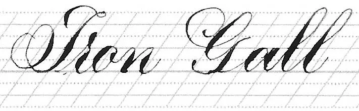
Iron Gall / Other Historic Inks
Iron Gall / Other Historic InksOkay, Iron Gall Ink is different than any of the other inks, namely for the fact that this is a highly acidic ink and will corrode nibs. There are milder forms of Iron Gall produced for Fountain Pens, but any traditional Iron Gall Ink would ruin fountain pens. Iron Gall will basically eat away at nibs, which is I why I steered away from it, despite the incredible blackness, the fact it’s waterproof and archival and makes the sexiest hairlines ever. I decided to come back to it, but more about that at another point.
Iron Gall is made by mixing iron salts with tannic acids which can be sourced from different sources, but most commonly is extracted from oak galls or galls from other trees (thus the name).
It has a light muted blue shade when fresh, and oxidizes into a wonderful deep black when in contact with oxygen. This btw is also where the term blue black came from, because you can literally watch the blue iron gall oxidize into a black right in front of you within seconds of writing a word.
There are other historic ink recipes you might find (I made ink a while ago using blueberries) Walnut Ink is one of the more common historically used ink as well, but talking about those now would probably go a bit too far.
Let’s talk about the actual list now!
Let’s talk about the actual list now!Okay, that ended up taking a bit more space than originally anticipated (haha, did I mention I have a bit of a google obsession when I can’t sleep?). But let’s talk about my actual list now. The before content will save us a bit of time though, which is also why I didn’t want to write this elsewhere since I feel like having the basic understanding of the different types and also knowing about my personal preference will probably help you in understanding how I chose my favorites and help you in choosing yours.
Here’s what I am looking for in my ink.
- I want hairlines
- I want it to flow smoothly
- I am not as concerned about bleeding most of the time, because I tend to use good quality paper
- Sometimes I want waterproof, but mostly I don’t
- I want thin inks
I present you in the following a few words on each of my top 5 and include samples written on 3 different types of paper. The Paper I used is Canon Red Label Laserjet Paper (this is high quality laserjet, but not necessarily a good Calligraphy Paper, it’s smoothish, but doesn’t have a high bleed resistance), Clairfontaine DCP Paper (the best printer Paper for Brush Lettering, because it is the classic Clairfontaine Brand Smoothness, smoother than Rhodia, thus the nibs don’t snag but it’s still not the best with bleeding) and Rhodia (one of the most popular Calligraphy Papers, some of them have slight bleeding on that paper). There is 0 bleeding on Tomoe River, which is my personal favorite paper and also the one I most commonly use, but because I know Rhodia is more commonly known and used I felt like it makes more sense to show you samples with that.
Number 5: Iron Gall Ink from Scriptorium am Rheinsprung Basel
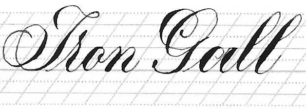
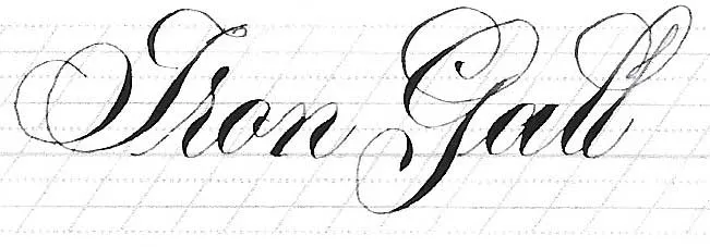
Number 5: Iron Gall Ink from Scriptorium am Rheinsprung Basel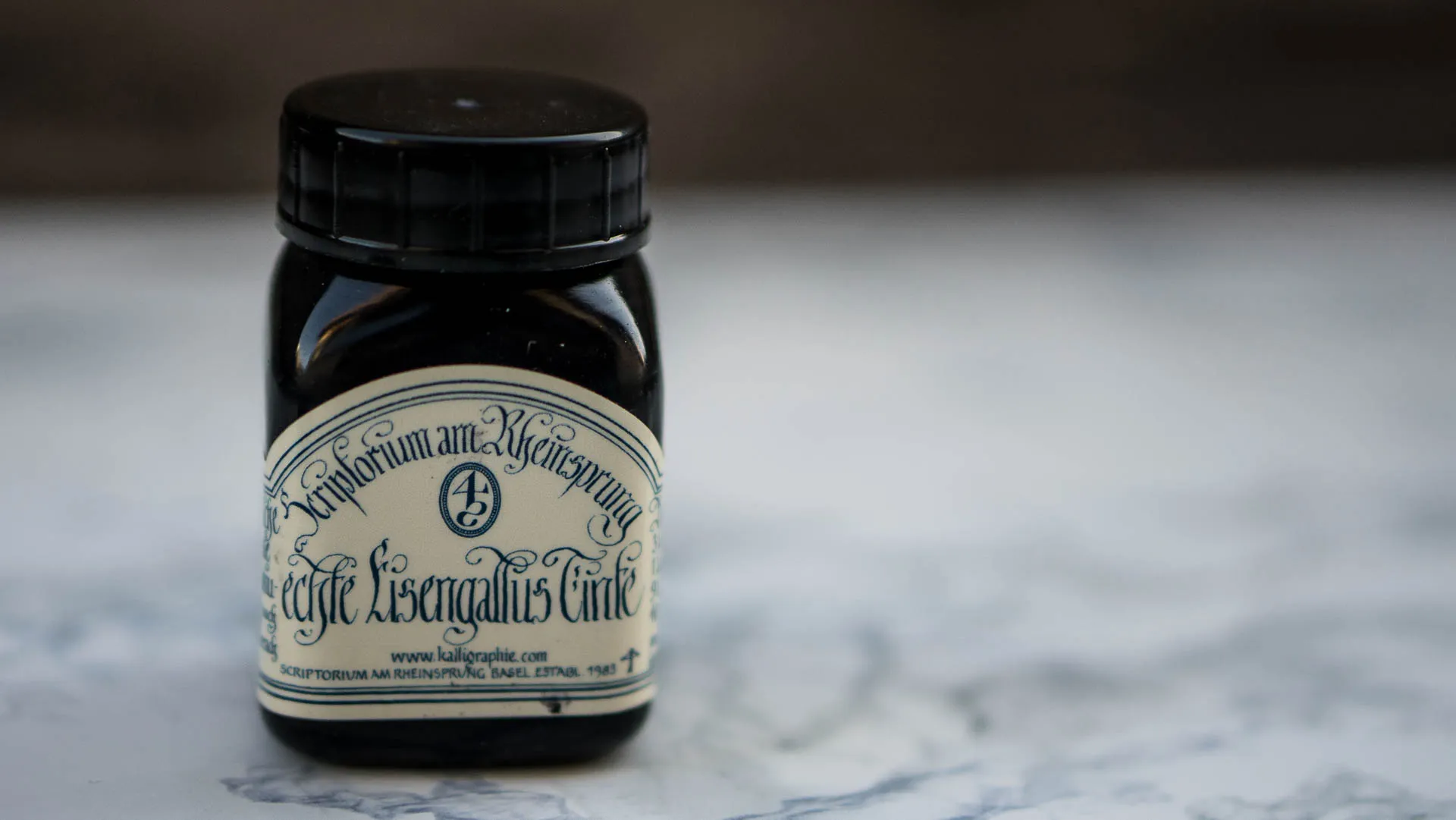
This is traditional Iron Gall Ink made in Switzerland that you can get at kalligraphie.ch. It is the only Iron Gall Ink I have tried so far and I do like it a lot. They sell it freshly made, so when you get it it’ll have a light blue color. They recommend you let it sit open for a week upon receiving it before use, which is what I did before I first used it, but then I realized how fast my nibs died and stopped using it for a good year, which did the ink pretty well, I feel like it’s definitely a richer black now. I came back to it, because I realized that it is good to have a permanent black that doesn’t have thick and ugly hairlines and I decided to dedicate one nib at a time to it. It’s my nib sentenced to die an early hairline heaven death and it’s usually a Gillott 303 or Perry 28, but actually G nibs will last a lot longer, I just don’t like to use them as much. Iron Gall is pretty bleed-resistant on mid to high range papers, but will bleed on Papers like the Canon and worse quality.
In order: Canon, DCP, Rhodia
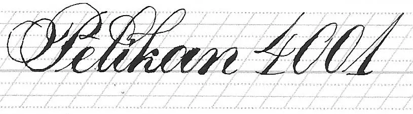
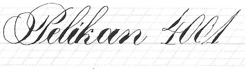
Number 4: Pelikan 4001 brilliant black
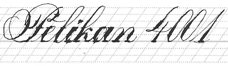
Number 4: Pelikan 4001 brilliant black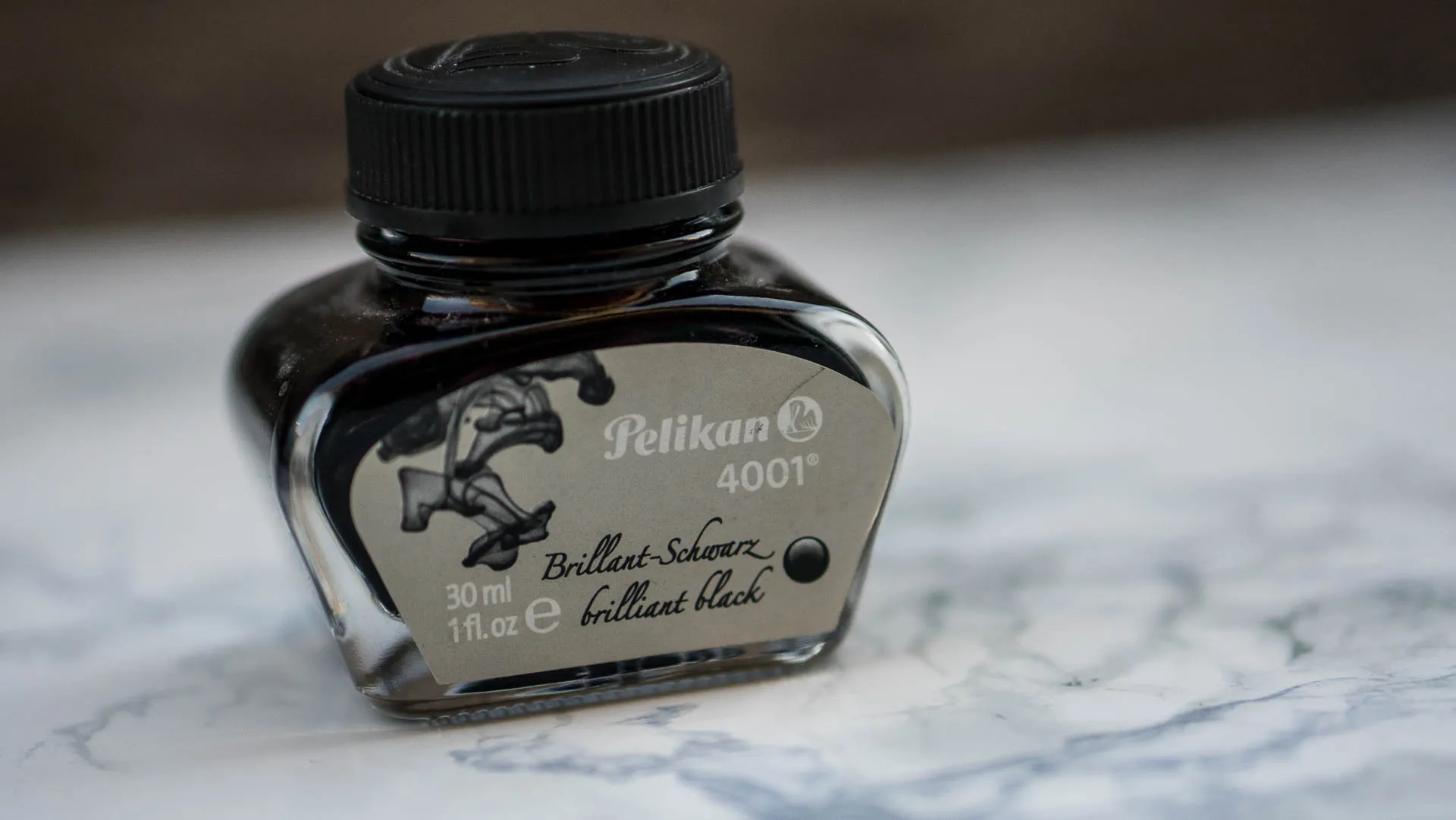
This is a fountain pen ink, the exact ink I used to get in cartridges back when I was a kid, so this ink has a bit of nostalgia attached to it for me. Of course it being a fountain pen ink (a rather dry one though) means it will bleed very easily. I do really like the flow of this ink on my Tomoe River Paper and I like that it just works without me having to tinker with the consistency. By now it definitely won’t surprise you when I say that I water the majority of my inks down to get better hairlines, right? I like my inks thin. I use this ink a lot for practice.
In order: Canon, DCP, Rhodia
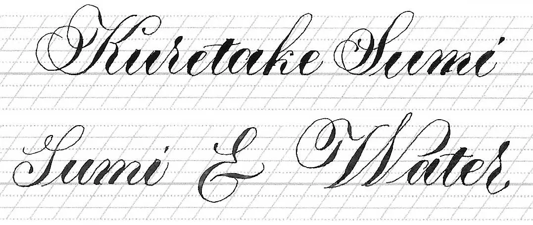
Number 3: Kuretake Zig Cartoonist Sumi Ink
Number 3: Kuretake Zig Cartoonist Sumi Ink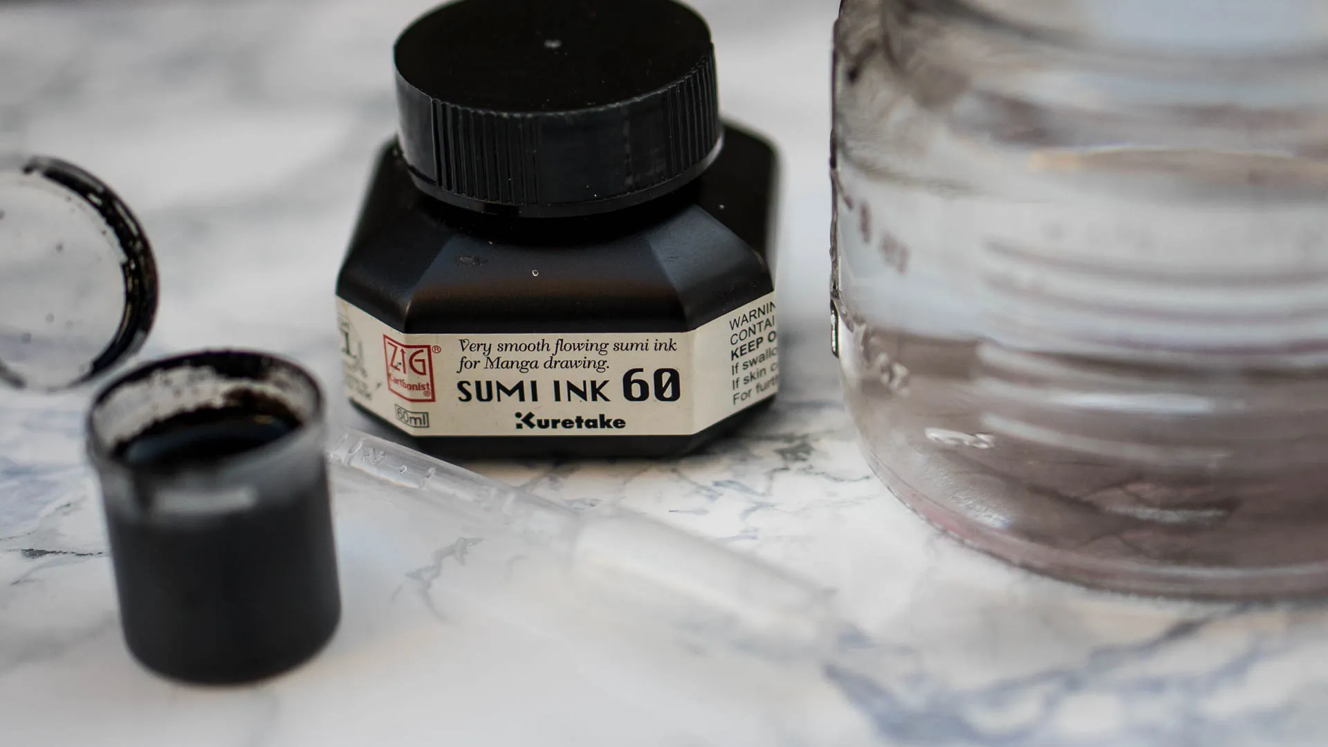
There are two versions of this Sumi Ink, the Cartoonist and the Comic version, the Comic version is the waterproof version, whereas this one is water-resistant only. Apparently this is the version more recommended for use with alcohol-based markers like Copic. Both Sumi Inks are described as based on traditional Japanese Recipes, based on the properties of each of them, I am assuming that each one of them uses a different binder. This version is smoother flowing, whereas the other version is quick drying, also the properties of water resistance and waterproofness lead me to the assumption that this is the version with the animal glue and the Comic version uses shellac as a binder. However I did not find the exact information online.
I personally never use Sumi ink on its own if I can avoid it, and I know that a lot of people thin it down, so I am not alone with my thinning in this case, which is why I wrote two Samples, one with the watered-down version and one without.
As you can see in the samples, this is one of the most bleedproof inks I know. Sumi was amongst the first dedicated Calligraphy Inks that I bought and I used to love it so much, it was my absolute favorite. By now it has been replaced at the top because my preferences changed, but also because Sumi has the tendency to dry up and is a pain to clean from the nib. It is also more on the thicker side for me, but it is an Ink I really like for its reliability. It is my ultimate Ink for Envelope Addressing, because those usually tend to be rather bleedy papers.
In order: Canon, DCP, Rhodia

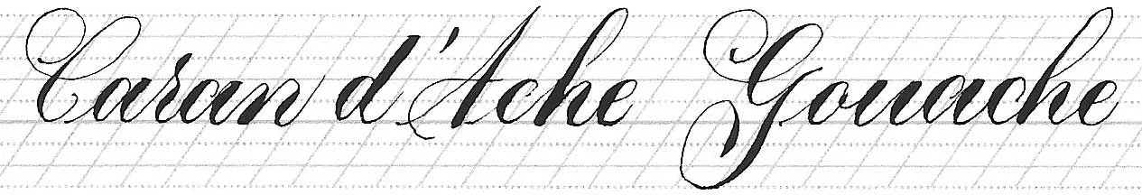
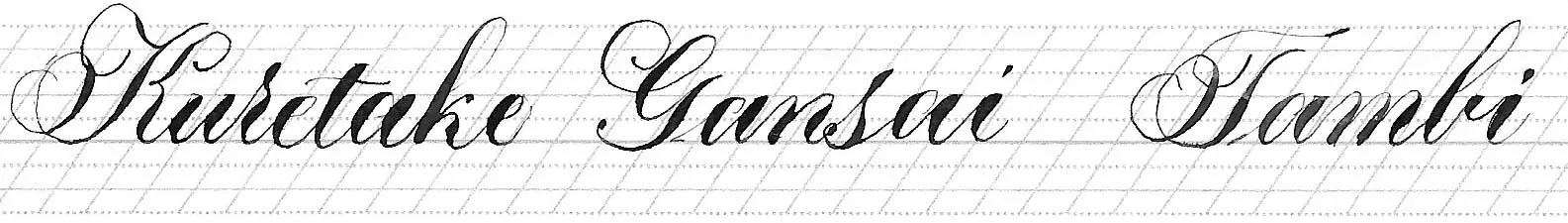
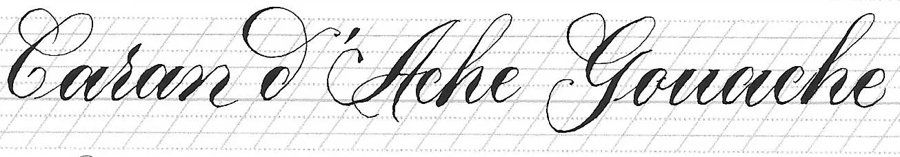
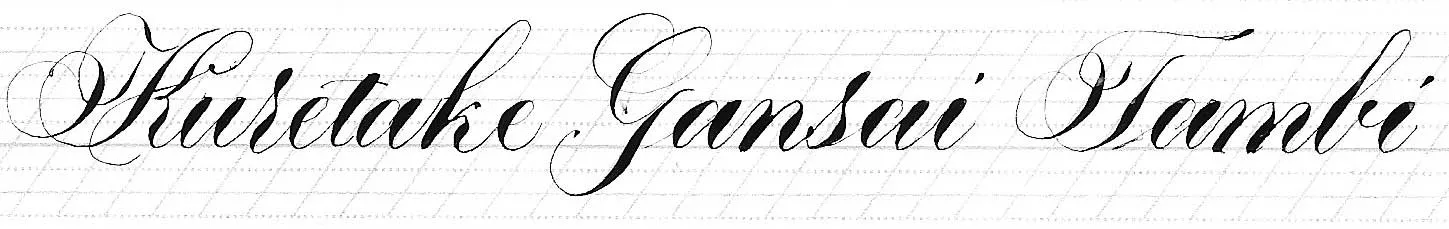
Number 2: Caran d’Ache Gouache & Kuretake Gansai Tambi
Number 2: Caran d’Ache Gouache & Kuretake Gansai Tambi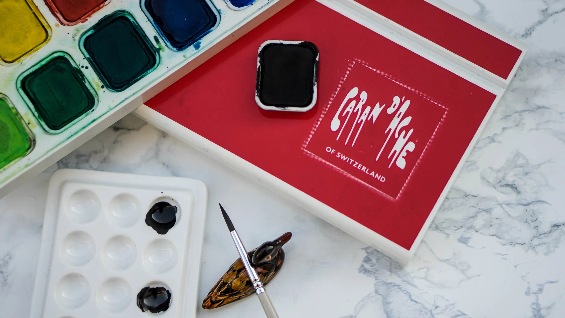
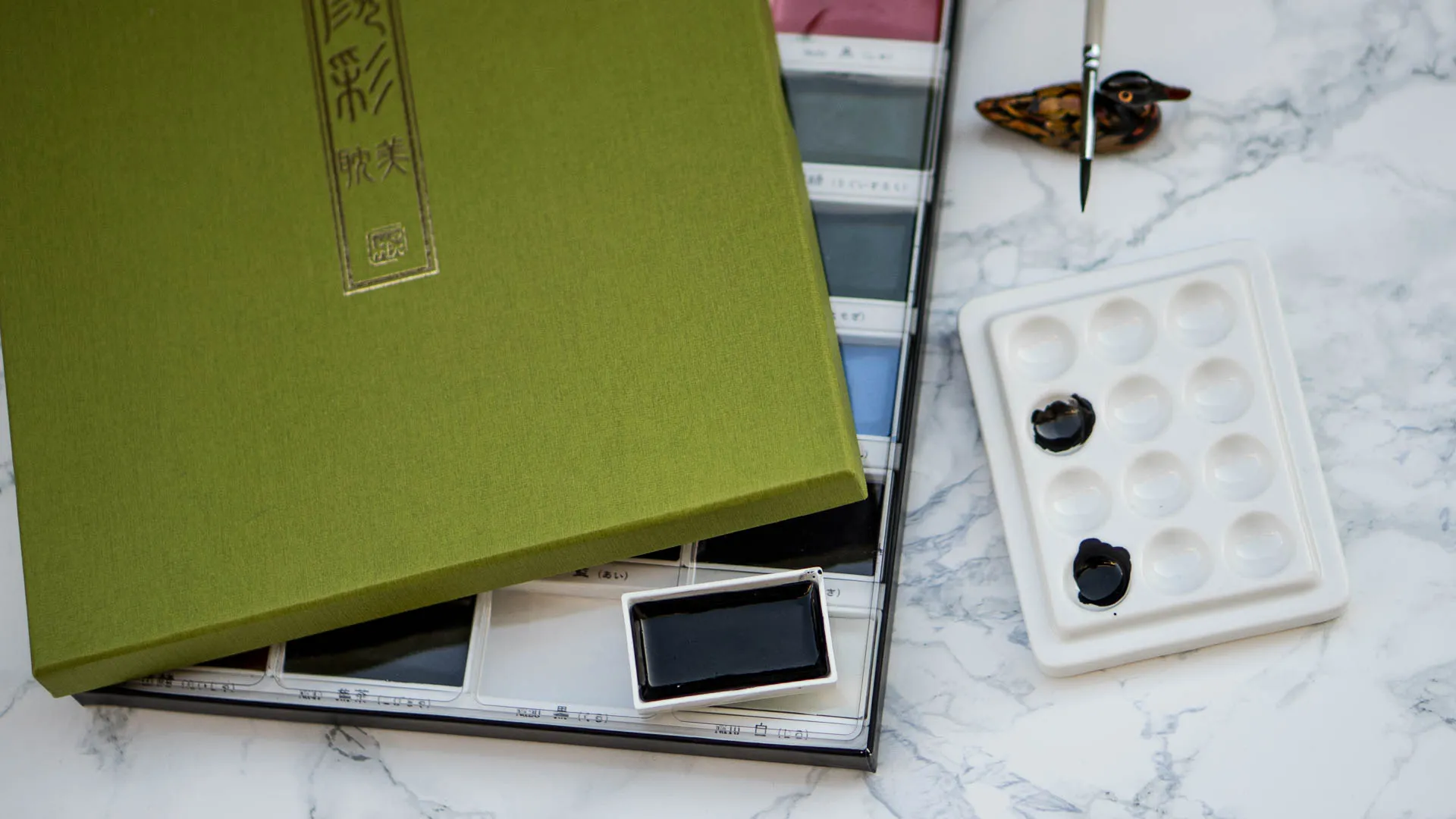
As I said before, those two are not the same, but they are very similar in terms of how they feel for writing. Both write extremely smoothly and are very pigmented. The Caran d’Ache Gouache is some of my favorite Gouache (I do however really like the Winsor and Newton Designer’s Gouache, don’t have the black though) I’ve had my set for over a decade and it’s still perfectly fine. Gouache is matte, whereas the Gansai dries more satin. I don’t prefer one over the other, to be honest. Maybe the Gansai flows a tad smoother, and has more colors, but I often end up liking matte a bit more. But really if it comes down to it, it really depends on my mood or which one is closer to grab.
The way I mix up pan paint is by dropping some water in the pan, letting it sit for just a bit, mixing with a brush and tipping it into a porcelain pan, then I brush the paint to the underside of my nib to use it.
This would probably be my Number 1 if it wasn’t for having to use the Brush because it’s an additional step. But apart from that I love the fact that you can really adjust the pigmentation and consistency. If you mix it up thinner, you don’t get bleeding at all, I went with a middle-range mix here in the example.
In order: Canon, DCP, Rhodia
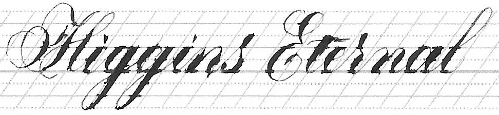
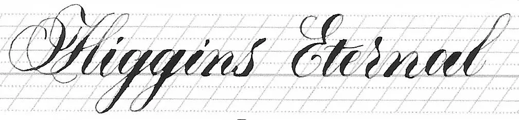
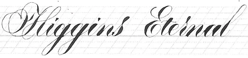
Number 1: Higgins Eternal
Number 1: Higgins Eternal
I only recently finally got myself a bottle of this ink and it has rocked my world ever since. This ink is completely fuss-free it just flows perfectly for me, produces beautiful hairlines and is wonderful to work with. But. And this might be a pretty big but for you. It is heavily bleeding. Again, I don’t bother much most of the time because I use good paper. I am absolutely in love with this, but I hadn’t actually done any research on what it actually was until I decided to write this post. According to the official Higgins Website Eternal uses Dyes and Pigment for color. This ink is not waterproof, it uses carbon as a pigment and is archival, so I assume that this ink is inspired by the original india ink, since it dries matte. John Neal advises anyone finding the ink too thin to thicken it up with gum arabic, I personally haven’t done this because it’s perfect for me, but you might want to try that if you find it too thin.
In order: Canon, DCP, Rhodia
That’s all Folks
That’s all FolksI hope this information was helpful and you learned something new. I’d love to know if you agree with my list, or are a complete opposite and how many of the different ink types you knew. Let me know in a comment, if you’d like.