A while ago I was asked how to get a similar effect for the navbar like in this template. After taking a look at the code I was not super happy with how they solved the problem and decided to do it a little faster and easiert. The result can be seen on the demo page.
So that we can start we do need a basic layout with some minimal styling.
For that I just used my start-off Repo and added a header and navigation. Header is just a heading with background image. The Navigation’s code looks like that:
    <nav>
        <div class="container">
            <img src="shrinkme.jpg">
            <div class="menu">
                <a href="/">Home</a>
                <a href="#">About</a>
                <a href="#">Contact</a>
            </div>
        </div>
    </nav>
So theres a general nav wrapping it, which contains a div.container which takes care of the max-width of the menu content. Then I added the image I wanted to shrink and a container which has the links in it. Pretty straightforward.
So that this does not look like complete crap, we will add some styles. First sass, then the generated CSS from that.
    $menu-bg: #4C7C6E;

    @mixin flexbox($d, $w, $j, $a) {
        display: flex;
        flex-direction: $d;
        flex-wrap: $w;
        justify-content: $j;
        align-items: $a;
    }

    nav {
        width: 100%;
        background: $menu-bg;

        .container{
            padding: 0;
            @include flexbox(row, wrap, flex-start, center);
        }

        img{
            border-radius: 50%;
            margin-right: 20px;
            border: 7px solid $menu-bg;
            transition: .5s all ease-in-out;
            padding: 0;

            &.small{
                height: 100% !important;
                border: 0px solid transparent;
                padding: 2px;
            }
        }

        .menu {
            padding: 14px 0;
            a {
                color: white;
                padding: 0 7px;
                &:hover {
                    color: white;
                    opacity: .7;
                }
            }
        }
    }
    nav {
      width: 100%;
      background: #4C7C6E;
    }
    nav .container {
      padding: 0;
      display: -webkit-box;
      display: -webkit-flex;
      display: -ms-flexbox;
      display: flex;
      -webkit-box-orient: horizontal;
      -webkit-box-direction: normal;
      -webkit-flex-direction: row;
          -ms-flex-direction: row;
              flex-direction: row;
      -webkit-flex-wrap: wrap;
          -ms-flex-wrap: wrap;
              flex-wrap: wrap;
      -webkit-box-pack: start;
      -webkit-justify-content: flex-start;
          -ms-flex-pack: start;
              justify-content: flex-start;
      -webkit-box-align: center;
      -webkit-align-items: center;
          -ms-flex-align: center;
              align-items: center;
    }
    nav img {
      border-radius: 50%;
      margin-right: 20px;
      border: 7px solid #4C7C6E;
      -webkit-transition: .5s all ease-in-out;
              transition: .5s all ease-in-out;
      padding: 0;
    }
    nav img.small {
      height: 100% !important;
      border: 0px solid transparent;
      padding: 2px;
    }
    nav .menu {
      padding: 14px 0;
    }
    nav .menu a {
      color: white;
      padding: 0 7px;
    }
    nav .menu a:hover {
      color: white;
      opacity: .7;
    }
So the animation for the image is already ready. The goal is to add a class of small once the image’s top reaches the top of the window. We’ll do that using jQuery. Because the element has a transition, it will animate instead of just jumping from one state to the other. To position this, I am using flexbox, because it saves me the whole floats trouble.
And then we are ready for javascript.
First you want to integrate jQuery and I will use a small plugin that I wrote a while ago for the sticky positioning. Then taking care of that is a breeze. stickyNav
The plugin has to be added after jQuery and then you just need to initiate it.
So download jQuery and the plugin and link to them. In my example these and an additional main.js files are within a js folder. I’ll add that above my closing body tag (</body>):
    <script src="/js/jquery-2.1.4.min.js"></script>
    <script src="/js/jquery.stickyNav.min.js"></script>
    <script src="/js/main.js"></script>
main.js is empty at this point, but we’ll give it some content in a sec. There we add all of our additional jQuery code. The first thing you might have noticed is the fast that after CSS the bar does not look like it should. Becuas the nav is currently containing the image instead of being a bar. That’s because we have not added a height to the container. So we’ll read the .menu height and add that to the container, so that it looks right.
Also for the transition to look pretty we need to add a height to the image. Because I don’t want that to be fixed, I^’ll have jQuery calculate it and add it inline.
main.js currently has the follwing content:
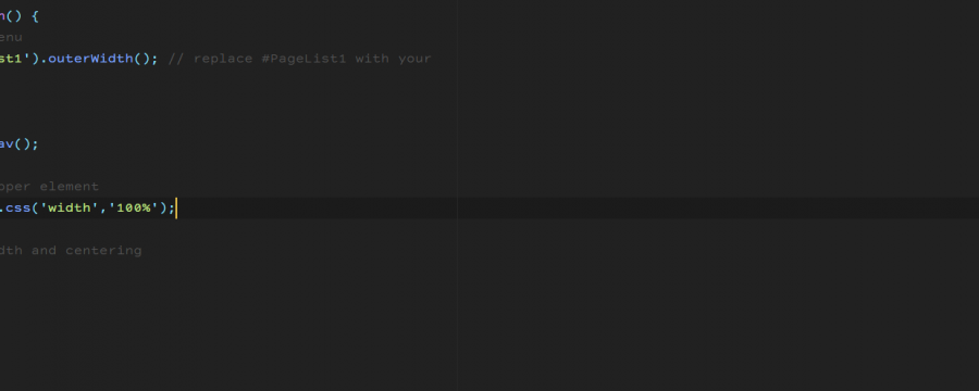
    $(document).ready( function() {
        $('nav img').css('height', $('nav img').height());
        $('nav .container').css('height', $('.menu').outerHeight());
    });
next is the stickyness of the nav. For that we just call the plugin on the sticky element. That’s done with one line.
$('nav').stickyNav();
For the animation we give the image a class based on the scroll position. If the window top and the top of the image are even, we add a class of small and remove it as soon as the statement becomes untrue. That triggers the animation on scroll.
    $(window).scroll( function(){
        if ($(window).scrollTop() > $('nav img').offset().top){
            $('nav img').addClass('small');
        } else{
            $('nav img').removeClass('small');
        }
    });
So the whole script looks like this
    $(document).ready( function() {

        $('nav img').css('height', $('nav img').height());

        $('nav .container').css('height', $('.menu').outerHeight());
        $('nav').stickyNav();

        $(window).scroll( function(){
            if ($(window).scrollTop() > $('nav img').offset().top){
                $('nav img').addClass('small');
            } else{
                $('nav img').removeClass('small');
            }
        });
    });
And then we’re done. The effect is done really fast and looks pretty cool if you ask me.