Tag: handlettering

background-image

Let’s talk Words

How Hand Lettering is not Calligraphy but Calligraphy is Lettering but neither is a Font because both are not Type

  1. Calligraphy 101 – The Beginning
  2. My Nib Collection
  3. Let’s talk Holders
  4. Calligraphy material save or splurge
  5. Let’s talk Words
  6. Get Better Hairlines
  7. My Top Black Inks
  8. Whiteout: White Ink Showdown
  9. Calligraphy Starter Kit
  10. Handmade Pen Holders

Words are confusing, especially when it comes to those “mushy” terms where no one is really sure what they actually mean. You guys know I am crazy about research, you know I love to write, I also am a gigantic word-fanatic so this is a subject I have been spending a lot of time with. I get the question whenever I make a comment about the fact that I am bad at Hand Lettering and prefer Calligraphy.

So then I try to break it down, try to explain it as shortly as possible but – hell I write novels for a reason. I have a hard time cutting myself short. But let’s just look at those words and see how successful I am at keeping it reasonably compact today.
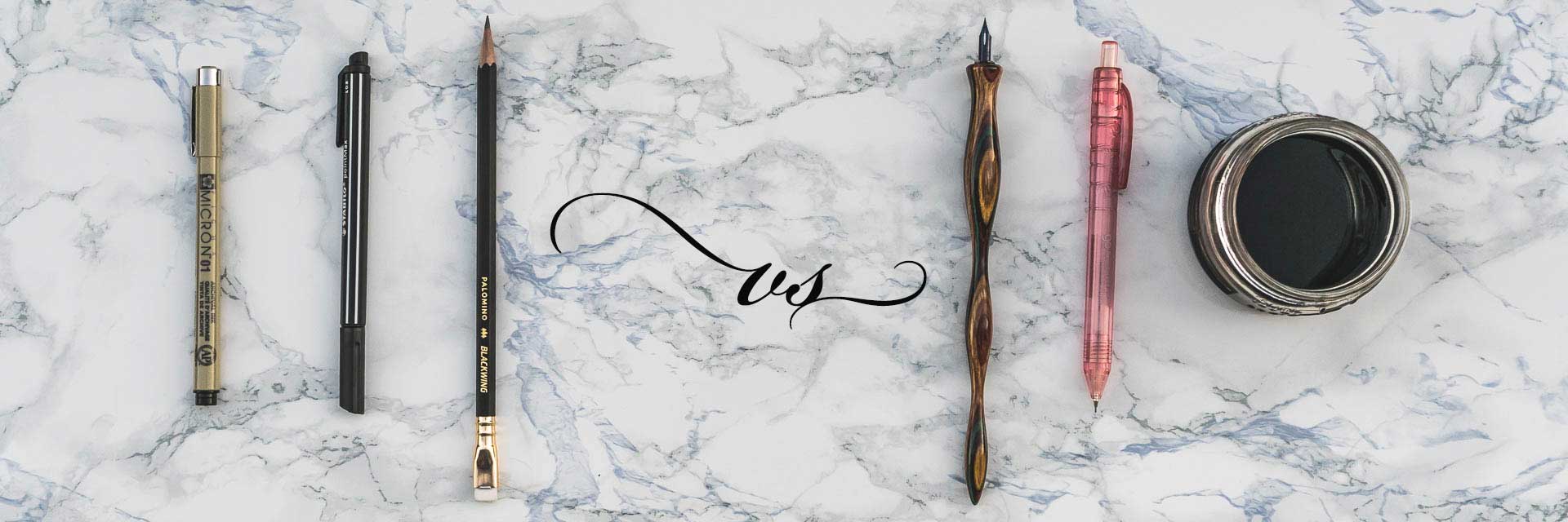
Continue reading “Let’s talk Words”

background-image

The perfect pressure curve for your iPad Lettering

How to find the perfect setting for your writing

The pressure curve in procreate seems to be kind of a mystery for a lot of people. As soon as it goes into curve some have problems because it looks quite abstract. But if you get the curve right, you can improove your results greatly, without having to master any additional skill.

I think the pressure curve is one of the most significant settings in iPad lettering, since differences of thick and thin are what brush lettering is all about.

In this short guide I’d like to take you along with my personal little search for my optimal pressure curve. I hope my tips can help you find yours too. Continue reading “The perfect pressure curve for your iPad Lettering”